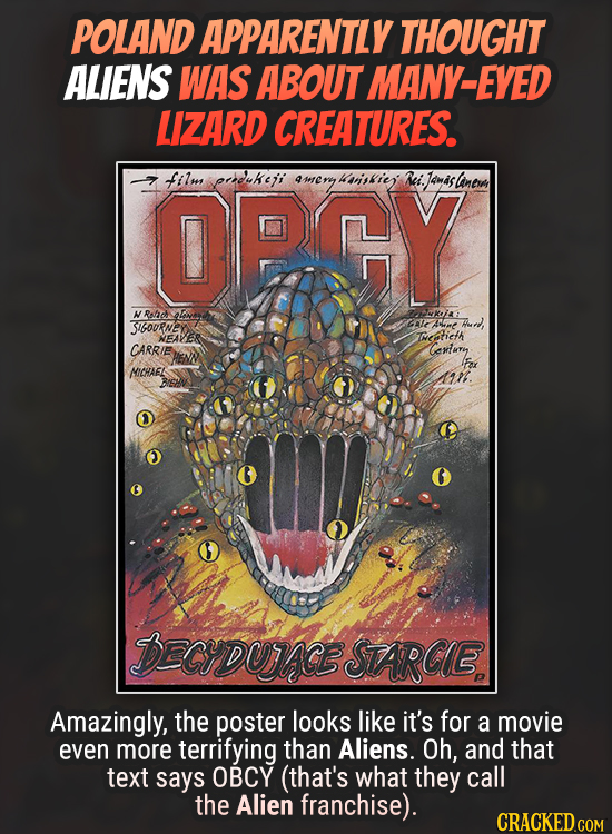
Movie Posters That Got, Um, Lost In Translation
Apparently mind-numbing surrealism is an advertising strategy, in some places.

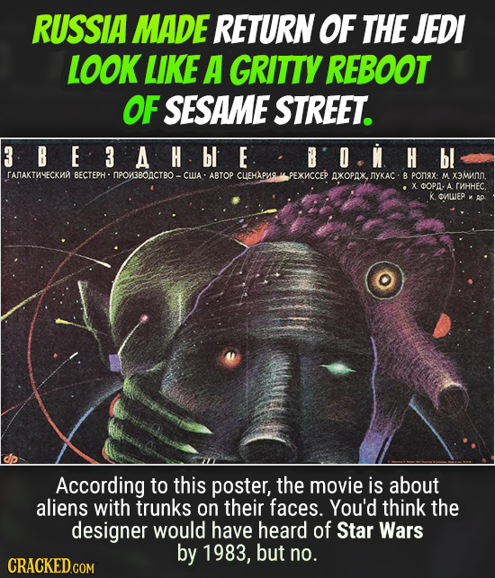
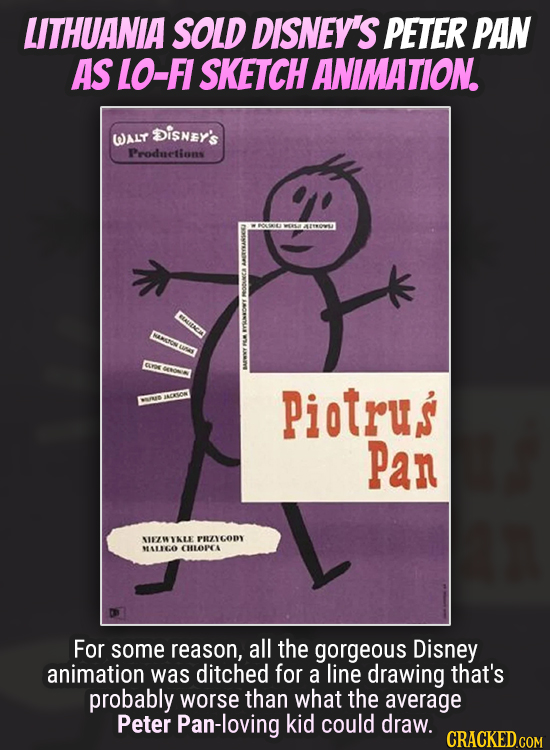
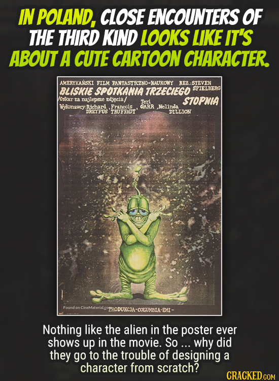
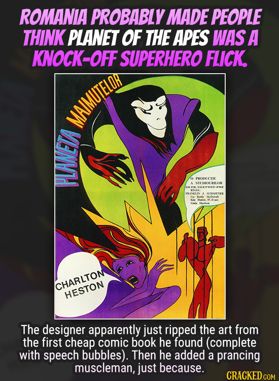
Movie posters are supposed to be a way to get butts into cinema seats, right? You'd think so. But in some cases, the people who design posters don't seem to think so. Instead they use poster design as an excuse to make bizarre art, as long as it has a wafer-thin connection to the movie it's supposed to be advertising. And the results range from baffling to outright bizarre.
Take a look.


The Godfather





Close Encounters of the Third Kind


Aliens
