


This Guy Probably Designed Half the Logos You Hold Dear

Logos are designed, by nature, to be as famous as possible. Name recognition is the entire mission, and the successful ones achieve positive identification from further away than even the highest tier of A-list celebrity.
But fame for the people who make those logos? Usually not as achievable, since graphic designer is very much a “behind-the-curtains” kind of job.
One man, though, is considered among the greatest logo and graphic designers in history. Don’t believe me? Just mention the name “Saul Bass” to any art-world friend, and you’ll be rewarded with a deep sigh of reverence. Even if you’ve never heard of him, I can guarantee that you’ll immediately recognize a few of the following graphics he designed.
Kleenex

Kleenex
Every time you’ve had a cold, standing stalwart beside you was a Saul Bass design.
Girl Scouts

Girl Scouts
One of Bass’ logos has also been in the vicinity of some of your most shameful snack binges.
AT&T

AT&T
It’s a common lament among the graphic-minded that corporations change their logo in moments of panic. One look at this, then at AT&T’s modern, gross little sphere, and you know they never should have disgraced Mr. Bass.
Bell Communications

Bell
When you’re a telephone company that literally bears the name of the phone’s inventor, you go to the best for your logo, and they did. Sadly defunct, but the logo still slaps.
Quaker

Quaker
Ironic that one of the world’s most tasteless breakfasts has one of its most tasteful logos.
Dixie

Dixie
The Queen of Cups herself! They made the horrible mistake to retire this logo after 35 years of service for something that looks like a knockoff printer ink company.
Lawry’s

Lawry's
Lawry’s Seasoning Salt had a space in the cabinet of every parent and a hand in every hurriedly prepared family dinner.
United Airlines

United Airlines
United Airlines is such a horrible company these days that I believe this logo should be taken away from them, and given to someone that deserves it.
Minolta

Minolta
A fallen giant of camera manufacturing, it’s a crime that this beautiful logo doesn’t still grace the world’s Best Buys.
United Way

United Way
When Bass designed this, I think he knew that T-shirts bearing it would fetch triple-digit prices in future vintage stores.
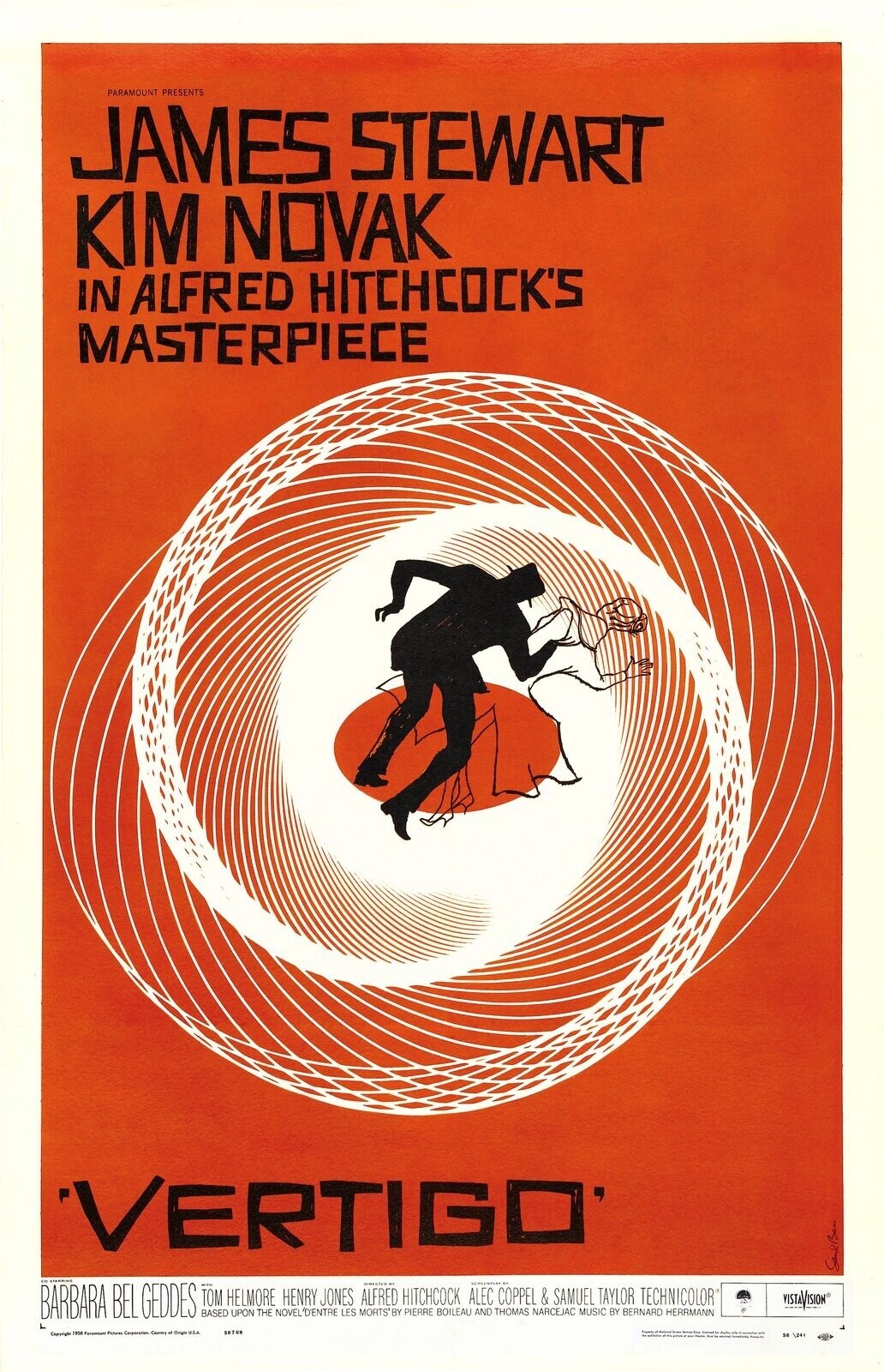
‘Vertigo’ Poster
Paramount
Bass also made his name with movie posters, like the one for Hitchcock’s Vertigo. Text your film bro friend and ask them if it’s on their wall: The answer is probably yes.
‘The Shining’ Poster

Warner Bros
Not as omnipresent in poster shops as the Vertigo poster, but for horror fans, his iconic poster for The Shining is still top-tier.
