


Animation Fans Lament How Pixar Is Apparently Trying to Be Grubhub

Thirty years ago, the venerated animation studio Pixar was on the cutting edge of 3D graphics as it led the industry into its Golden Age. Flash forward three decades, and the mediocrity of corporate aesthetic coupled with delivery milkshakes have rounded that edge into dull, doughy disappointment.
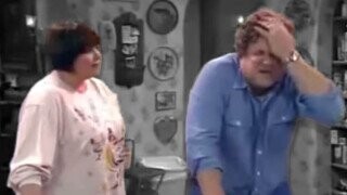
Despite generally positive reviews and a preposterously benign premise, Pixar’s new Disney+ miniseries Win or Lose, which tells the story of a middle school co-ed softball team preparing to play in the league championship, has generated more controversy for the kids’ entertainment giant than the disturbing lack of 9/11 references in Turning Red. First, Pixar made headlines for cutting a planned plot line that would have established one of the child characters as gender non-conforming like their voice actor, then the studio’s decision to shoe-horn an awkward and explicitly Christian prayer scene into a recent Win or Lose episode generated cheers on the right and eye-rolls on the left.
Don't Miss
But the pivotal aspect of Win or Lose that has Pixar fans most incensed isn’t the show’s ham-fisted waffling between sides in the culture war. Rather, it’s the way that the miniseries’ characters look like they’re about to start rapping about ham and waffle sandwiches delivered by a gig worker on a broken bicycle:
As animation fans who rushed into the replies of the OP who wants to have sex with the Win or Lose mom pointed out, there is a disturbing sameness in the art style of the series when compared to the rounded, sleek, bouncy 3D animation that currently litters the commercial space. The worst offender of the corporate look in modern animation is, of course, the infamous “Delivery Dance” commercial that Grubhub released in late 2020, in which rotund, glossy and gyrating characters hip-thrusted into their salads as they launched thousands of hate-memes in the all-time worst advertisement in food delivery history.
However, one solitary screenshot cannot capture the complexities of Pixar’s painstakingly crafted animation, even if the shape, facial expression, texture and colors of the Win or Lose character model are eerily similar to those of a certain jiggling sandwich-eater who unintentionally inspired countless Grubhub users to download DoorDash. Pixar defenders were quick to jump on the threads trashing the art style of Win or Lose, with one animation expert saying of the infamous commercial, “The most annoying impact this Grubhub advert had are the amount of people comparing it to EVERYTHING while seemingly having collective amnesia to what the actual fucking commercial looks like. This has more semblance to the average Illumination film than anything in Win or Lose.”
“It helps when you don’t just use one TV show and compare actual Pixar films to other films,” another incensed Pixar fan responded to a critic, pointing out that recent Pixar features Inside Out 2, Elemental and Luca all had unique and non-blobby art styles. “Seriously cracks me up this one TV show is apparently the only representation for Pixar according to people on Twitter. But sure, everything is ‘corporate blobs’ if you don’t pay attention.”
Even still, it doesn’t take an animation degree to recognize that the the smoothness, simplicity and globularity of the character models in Win or Lose are aesthetically similar to the average, unskippable 3D animation that precedes a YouTube video about an influencer taste-testing international flavors of potato chips. We’ve seen plenty of characters who look and move like Win or Lose's Vanessa Rodriguez, voiced by Rose Salazar, in projects designed to sell products with bright colors and overly jiggly motion.
But, hey, for all the criticism, against it, Win or Lose is still the product of hundreds of artists’ hard work, and the end result is a labor of love — and, as the commercial taught us, you must always Grub what you love.
