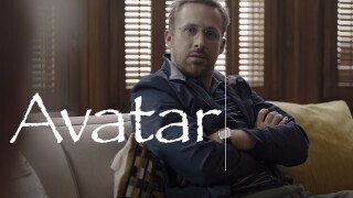
The Creator of the ‘Avatar 2’ Font Was Fueled by ‘SNL’s Papyrus Mockery

Forget Barbie, Ryan Gosling just gave us the most highly-anticipated Ryan Gosling sequel: “Papyrus 2,” a follow-up to the 2017 Saturday Night Live sketch that found the actor raging against James Cameron’s Avatar for selecting the pre-existing typeface — better suited to Shakira merch, hookah bars and off-brand tea — for his $200 million plus blockbuster. The graphic designer must have chosen it “like a thoughtless child just wandering by a garden, yanking leaves along the way,” Gosling mused.
Despite the fact that it was the one SNL sketch in which Gosling didn’t giggle uncontrollably this past weekend, the pre-taped segment was ultimately cut for time. Fortunately, the whole thing was quickly uploaded to the internet. In the new sketch, Gosling’s character once again comes close to the brink of madness after realizing that the new and improved Avatar: The Way of Water logo is really just “Papyrus in bold.” Also, there’s a twist ending in which we find out that he’s secretly the son of the Wingdings guy.
But while the original made a good point — Avatar’s logo really did look like a barely-modified Papyrus — the sequel’s contention that The Way of Water’s typeface is merely “Papyrus in bold” is a flat-out lie, as some fans pointed out.
This false premise is extra-egregious because at least one person involved with creating the new font was clearly inspired to make something SNL couldn’t possibly ridicule. According to Swell Type’s John Roshell, when he was tasked by James Cameron’s Lightstorm Entertainment to come up with an entire font based on the new Avatar logo, he considered it the chance “to right what some consider one of the great typographic wrongs of the 21st century,” questioning, “Had they been watching SNL too?”
When he got the call, Roshell even considered asking the company if the sketch inspired them to make the change, but held back out of a fear that they might “hang up.” He later elaborated in another post that he, of course, had seen the Papyrus sketch, like “any self-respecting type designer” and considered it to be “Ryan Gosling’s finest performance.” He also showed off how he sketched out the new font by hand, based on the logo, ending with the (possibly regrettable) challenge: “Alright, Gosling, let me have it…”
“Papyrus 2” could have found other ways to poke fun at the new Avatar typeface. When it was first released, some critics pointed out that there was way too much space between the last two letters, making it look like like it read “AVATA R.” Instead they opted to go with a joke that can be debunked in two minutes with Microsoft Word. Or can it…
Some viewers have attempted to make sense of the sketch’s nagging inaccuracy by proposing a novel fan theory: What if Gosling’s character (Steven Wingdings) was so “deeply traumatized” by the Papyrus incident that he merely hallucinated that the Avatar: The Way of Water logo was Papyrus in bold.
Then again, perhaps we’re putting too much thought into something that Lorne Michaels couldn’t even be bothered to put on television.
You (yes, you) should follow JM on Twitter (if it still exists by the time you’re reading this).