Fact: Retro Video Game Cover Art Rocked

Square Enix, Activision Blizzard
Who doesn't immediately feel their nostalgia sense tingling whenever they think about good old video game box art? That's not just because it absolutely owned; it's also because the industry seems to have sadly given up on making sick-ass art to promote their games. With this, we're not saying that all retro box art was museum-worthy. A considerable portion of it definitely wasn't, but we can't help but feel like we're getting a disservice when even hilariously bad art gets replaced by no art at all. Most game box art/covers nowadays are just a CG render of the main character, making them mostly interchangeable noise. Many blame the trend on how the industry has greatly shifted from physical copies to digital ones, but there's more to it. It was long before we all fell under Steam's rule that game developers started slacking off in the box art department.
What better example than the cover art of Final Fantasy VI for the SNES. It featured art by Yoshitaka Amano that beautifully showed the game's main character and world.

Square Enix
Don't Miss
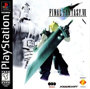
And then looking at the cover art for the American version of Final Fantasy VII, a game that came out in '97, just III years later.

That's not even the worst offender, but it began the trend of featuring a bland CGI render instead of some sweet-looking art. Ok, we know that the idea of using some lush painting to promote games that can in no way match what's on the box was essentially a scam, but it was a scam that we only fell for/had our parents falling for once. After popping the cartridge in, we got disappointed that the beautifully detailed characters turned out to be just simple sprites, but if the game was good enough, that was just fine. Even as kids, we very quickly learned that no actual gameplay could match what was on the box.
(Even though it came much closer to it on CRT TVs than it does on modern ones.)
A mere decade later, most games began just featuring a generic CGI render of the main character on its box.

Square Enix
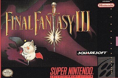
Now, let's go back to the aforementioned box art from FFVI. Many American fans of Final Fantasy are blissfully unaware of what they've been missing out on because FFVI was originally released in the US as Final Fantasy III (either Japanese devs don't get numbers or they think Americans don't understand numbers, and therefore just ship them incorrectly numbered FF entries as a joke). FFVI's US and its box art looked like this.

Square Enix
And it's not just a Final Fantasy problem. Most Japanese games have absolutely awful US covers.

Konami
Whereas Europeans got:

Konami
This isn't even a matter of having to work harder on art. Sometimes less is more, much more. Like, here's Resident Evil 4's very crowded American cover

Capcom
And here's the much simpler and still way more chilling cover for the Gamecube's European version.

Capcom
But we digress. ‘04 isn’t retro yet, right? Right?! Anyway, It's borderline traumatic that even new versions of classic retro titles that used to feature glorious box art have forgotten how awesome that was. Let's look at Diablo 2's beautifully creepy original cover art.

Activision Blizzard
And now let's witness the whack job that is the remaster's cover.

Activision Blizzard
That gorgeous art was already there! All they needed to do was pay the goddamn artist to draw a more HD version of the original painting because that's totally how paintings work! Instead, we have to get the bland CGI model face treatment – even when there's no actual face to speak of.
Hats off to the DOOM series, which went off the rails to give us the generic CGI cover treatment with DOOM 3 back in 2004.

Bethesda
But then climbed right back on to the hell ride by having DOOM (2016) feature an alternate cover in the vein of the original.

Bethesda
Now, it would be dumb to just not accept that digital will eventually kill physical media, but there are two things we can ask for. We'd like for developers to find a new outlet to make up for the lack of cool game art outside of the games themselves, which can come in the form of more original and dynamic console user interface themes and steam backgrounds. The other thing is, even if just in a limited capacity, the return of the PC big box art.

Nvidia
Top Image: Konami