Fans Are Reinventing 'Elden Ring' In Funny, Bizarre Ways

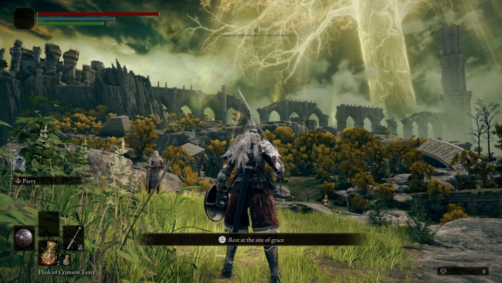
Elden Ring is a divisive title. Some hail it as the best game of all time, while others diss it as just one of the best games of all time. What even those nasty naysayers don't know, however, is how the game could be much, much worse. One of the things that made people fall in love with Elden Ring is how it nails open-world gameplay and how it (mostly) nails the simplified user interface people have been asking from most big game developers for over a decade. Long have fans been repressing their anger towards Ubisoft for constantly discarding a clean user interface in favor of over-complicating things via the imposition of bizarre clusters of information, so now they're poking some fun at the company by creating mockups of what "Elden Ring by Ubisoft" would have looked like.
First off, it's important to show you how simple and clean the user interface for Elden Ring usually is.

Bandai Namco
Don't Miss
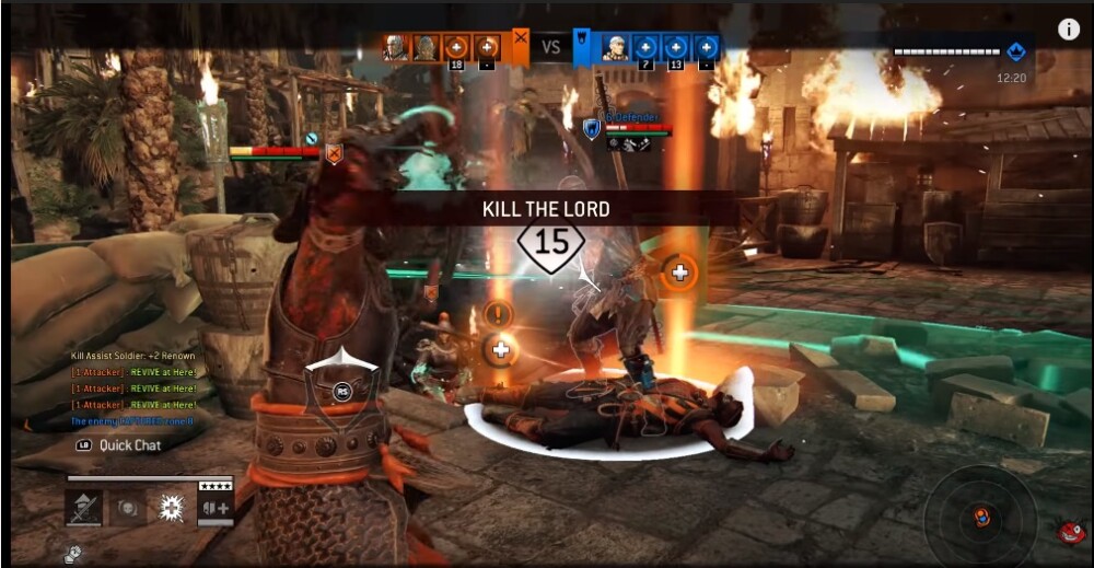
Under Ubisoft, however, fans joke it would have looked like this:

Bandai Namco
Ubisoft devs didn't take the diss too lightly, which leads me to believe they're developing stuff that looks like this in their sleep.

Ubisoft
Learning how self-conscious the devs were in regards to their beautiful user interfaces inspired Elden Ring fans to create pure art out of criticizing all sorts of unnecessary interface features.

Bandai Namco, Rockstar
Like, all of them.

Bandai Namco
The best of the bunch is Elden Ring by Polyphony Digital, the company behind Gran Turismo 7 that hasn't made a non-racing game in over two decades.

Bandai Namco, Polyphony Digital
And while it's hilariously dumb, it's also something we just learned we really want.

Sony, Polyphony digital
Top Image: Bandai Namco