5 Moronic Mascot Failures Companies Actually Rolled Out

Brands love their mascots. It's something of a time-honored tradition in this country to put a face to a product. Have some oats you need to sell? Put the love child of Benjamin Franklin and Raiden from Mortal Kombat into a dumb little hat, and away you go. About to go into the impossible mission of digging your hand into a tiny ass tube for the final quarter of those potato chips you paid for? Wouldn't it be a lot better if there was a weird asshole in a mustache staring at you while you struggled?
For whatever reason, this marketing tactic has stuck, and for many brands, it isn't going anywhere. But that's not to say they haven't missed along the way. For many big brands, the lazy, stereotypical, or just plain terrifying mascot they regularly march out before you now are actually their second or third attempt. Their best version. Let's take a look at some of their earlier attempts. The ones that didn't stick. The really bad ideas on something that was already a really bad idea to begin with ...
Before The Cheetah, There Was The Cheetos Mouse
Don't Miss
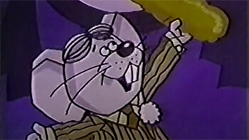
When it comes to brand mascots, few are more recognizable than Chester Cheetah, the lecherous, sunglasses-wearing cat that plays it cool until someone drops a bag of Cheetos in his presence. He's probably mostly recognizable because he makes you wonder what this big cat that seemingly can only get truly horny for crunchy cheese snacks has to do with crunchy cheese snacks. But even if it seems like Chester has been lounging around beside bags of Cheetos on our screens forever, just kind of slyly pulling his leather jacket down enough to cover his weird cheetah boner that's growing as soon as someone busted out a pack, he wasn't actually the original animal mascot for the snacks. That honor goes to the Cheetos Mouse, who ran out alongside the snack in the early '70s
Unlike Chester, the Cheetos Mouse was more sophisticated. More scholarly. He was a man of many talents. He could fly planes, or paint, or pilot space ships. Chester has one talent: blow his load in his cheetah jeans when a speck of Cheetos enters the atmosphere six states over.

Cheetos
The Cheetos Mouse is closer to what you'd see in the earlier days of mascot advertising. Somewhere, some agency thought: who likes cheese? Well, mice like cheese. Let's put a damn rodent on TV and have him sell food to people. Because there is nothing that humans like more than when their food is near rodents. In the earlier days, it was a one-to-one correlation between the brand and the mascot. Selling motor oil in the 70s? Have an animated dinosaur decaying right before the viewers' eyes like the cartoon dinosaur just saw the Ark in Indiana Jones, and you're set. Now, much like Chester, they don't have to be remotely related. Got a frosty cereal that needs selling? I don't know, shit, just put an eyepatch on a snake and CGI them committing arson and generally being a total creep in pursuit of their favorite cereal.
The Cheetos Mouse was perfectly fine as a mascot. He got the job done. But perfectly fine is probably not enough when your product is just perfectly fine. You need someone to distract you from the fact that those are simply toxic orange caveman clubs that taste like an alien civilization was shown a picture of a block of cheese and had to do their best to guess what it tastes like. You need a perverted cheetah who spanks it to toxic orange caveman clubs if you really want to move units.
Pizza Hut Pete, The Stuffed Crust Sterotype
Another staple of old advertising mascots is outright stereotyping. Much like the laziness of choosing a mouse to represent your cheese product, many of these companies just went to the basest stereotype their product may be loosely culturally tied to. Perhaps nothing was more impacted by this than Italian food in the 60s and 70s. If you had a product that was remotely "Italian," there was going to be a fat, mustached man plastered right up beside it.
Hell, if you were a carpenter, making bespoke wooden chairs, and you accidentally got a bit of oregano from the sandwich you were eating on your lunch break onto one of said chairs, the next day your place would be called "Big Tony's Original Meatball Chair." There would be a cartoon Italian man in an apron taking a huge bite out of a wooden chair on the sign, even though your family is from Denmark and your name is Rick. You're Big Tony now. You do Italian carpentry.
So, with that logic embedded in American culture, it was only natural that Pizza Hut went down that road when creating their very first mascot, Pizza Hut Pete.

Pizza Hut
As you can see, Pizza Hut Pete is pretty damn unremarkable. He's what happens when you drop bricks on the fingers of an amusement park caricature artist who's never traveled outside of Ohio and ask him to draw an Italian man. Pizza Hut Pete is pure, unabashed laziness. So much so that you have to respect it. He's an afterthought. He's an "Oh, shit!" moment for the Pizza Hut team, realizing they're about to launch their big national pizza chain without a mascot. He's some illustrator's Friday at 4:30, about to sneak out the door, when the boss catches him with one last assignment.
Even Pete himself looks like he knows he's not supposed to be there. Like he won't be around for too long. He's got the energy of a disinterested dad at his kid's elementary school play; just getting him to show up was a damn miracle, and he's not really sure what the hell to do from there. It does go to show that Pizza Hut probably could have used a mascot that stuck on. Because what the hell is Pizza Hut even these days? It feels like one of those things that exist, quite ubiquitously even, but you have absolutely no proof of it. You haven't been in or seen one since the early 90s, but you see commercials and have heard rumblings about one a few towns over. Maybe if they had gone with Pizza Hut Pat, a perverted, pizza-gobbling Aardvark in a denim jacket who can only get hard from pizza, they would have actually been on to something.
McDonald’s Speedee, The Franken-Burger
Some brand mascots seemingly get a free pass. Like they've been so ingrained in our culture and consciousness that we never even stop to take a good hard look at them and question A) what the hell they are, and B) if they should actually be burned with fire and ejected on a reverse space ship to the core of the Earth where they can't hurt us ever again. Nobody needs that treatment more than Ronald McDonald. The fact that we all collectively accept this horrific creep as just part of our lives speaks to how easily we can be programmed by these brands and these advertisements.
Seeing Ronald McDonald in person gives me the same bodily reaction to what happens when the sounds of a small bunny being attacked by a fox in the woods at two in the morning shrieks through my window on a hot summer night. The hairs on the back of my neck shoot straight up. My heart begins racing. I know I won't be sleeping again for days. And I reach for a damn hamburger anyway. It's the natural order of life. So with that in mind, it's wild to think that McDonald's first attempt at a mascot was somehow, maybe, even more disturbing than old Ronald. If nothing else, Speedee, was every bit as lazy and odd.

McDonald's
Look at this weirdo. What is he? I'm told that Speedee's head is a hamburger. Does that look like a hamburger to you? I suppose, exactly in the way that McDonald's has conditioned us to accept Ronald McDonald, they too have conditioned us to accept their definition of a hamburger, which looks like swamp mud formed into a circle and jammed between patties. Speedee is a winking demon burger that says one thing to me, if you come to this establishment, ya ain't leaving. He's winking because he knows a terrible secret, one that you will soon find out when you pass through those golden arches.
He's winking in the same way that McDonald's food is just a wink at your body. Sure, this is technically food, enough to pass legal specifications. He's winking in the way you wink at your heart when you go to town on a 20pc nugget. That fake, insincere wink of a weak promise to back that meal up with some greens and fruits for the rest of the week. Speedee is a goddamn monster, but Speedee was just the boss you fight before the real boss. The one whose health bar you bring down, thinking the game is over, and then Ronald McDonald cracks through the core of the Earth swinging his meat hammer ready to mess your shit up.
The DURACELL Bunny
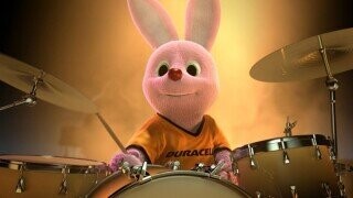
No need to reread that; you got it right the first time. Because these brands and their campaigns are so pervasive and insidious, you may have read the title above and snapped to the defense with a, "Uh, no! Actually, it's the Energizer Bunny, you goddamn idiot!" And, well, you'd be right about that. But, before Energizer made a drumming pink bunny the face of batteries in the '80s, Duracell marched one out a decade before.
Though it wasn't a major campaign, it made enough of a mark on Energizer that they decided to parody it in their own spot. After people gravitated towards Energizer's bunny, which was just a play on a competitor's bunny, they went to court to make their bunny, which they stole from another company, their own bunny. All to sell batteries. Using a bunny. I know, it's confusing and awful and everything that's wrong with the world, so, of course, a settlement was reached that let Energizer maintain the exclusive rights to bunny battery representation in North America.

Duracell
Duracell went on to keep rolling out their battery bunnies in the UK and elsewhere, but it clearly never reached the iconic status that the other battery bunny did. In writing this, I have felt my brain pour a little bit from my nose. It is such a vibrant illustration of how stupid the idea of a brand mascot can get and just how inane our focus can become on the material in this world.
I would do anything to go back in time to a group of cavemen, all huddled in their den, freezing their nuts off. Pooping in their laps and rubbing it on themselves for an extra layer of heat or whatever it was that cave people did. I'd walk into their cave. Flashlight in hand, so they know I'm a god. Then, I'd just start painting on the walls. I'd paint the tale of the future. Of the great bunny marketing war. Where battles were fought in a ring made of wood and people swung hammers that struck into order the holy decree that there could only be one bunny to sell the people batteries. The cavemen would then grab me, kill me in horrific death-by-caveman fashion, and then set out to destroy every last one of their kind so that they would never reach this terrible future ahead.
Frito Bandito … Just Everything About The Frito Bandito
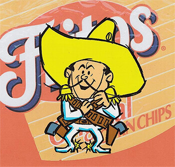
Everything we've seen before is nothing compared to the dogshit that Fritos marched out in the late '60s. Remember the mildly stereotypical Pizza Hut Pete from above? Well, he's nothing compared to the Frito Bandito, a mascot that was seemingly created by passing a box of crayons and loose white paper around a Klan meeting. Positioned as a tricky, Frito-stealing Mexican bandit, he spoke in shitty English and was on a quest to yank people's Fritos from them. To go with it, he was adorned with just about every stereotypical physical and clothing choice imaginable and then thrown out onto TV screens for the entire nation to take in.
Despite this being a time when outright racism was pretty prevalent and allowed on television and in branding in general, the Frito Bandito was even a bit too much. After pressure, Fritos decided to admit that they were wrong and erase the character completely.

Frito Lay
Just kidding! When pressured, they made some huge changes to the character design that would make it far less appalling to anyone with a brain. They, uh, they got rid of his gold tooth and his beard -- just an absurd consolation. It's like if Skittles decided to make a new mascot that was actually just a carbon copy of The Incredible Hulk. When Marvel comes at them being like, hey, that's our guy, Skittles just changes his ripped khakis into ripped jeans and makes him blue instead, not addressing any of the actual concerns or main issue.
What's even more absurd, they removed Frito Bandito's pistols after the assassination of Robert Kennedy. Because, you know, god forbid your snack-stealing bastard would remind anyone of a hyper-specific event through an incredibly loose visual connection. Forget any blanket stereotypes; he's literally oozing to a massive population just by every single detail of his appearance. Eventually, Frito Bandito was phased out. But, of course, not because of any perceived wrongdoing or bad taste on their part, but just because they had another mascot they wanted to march out there instead. The true circle of brand mascot life: arrive, offend, disappear, arrive again newer, stronger, and ready to offend like never before.
Top image: Duracell