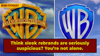
Warner Bros. New Logo Exemplifies Why We Hate Brand Redesigns

Move over PetCo's "cold and lifeless" redesign and Smucker's minimalist logo abomination, there's another brand revamp in town, reigniting feelings of anger and annoyance in consumers everywhere -- Warner Bros. new animated opening title, as depicted on screen for the first time in the company's latest quarantine heist flick, Locked Down, according to CBR.
Back in 2019, Warner Bros announced that they'd be revamping their classic golden shield emblem for a minimalist blue and white logo, inspired by the company's own vintage branding and apparently the Golden Ratio. The change was met with skepticism and, well, disdain; a survey of 1,001 respondents found that only 11% of people preferred the studio's new branding to its classic fare, a sentiment that hasn't changed much after audiences saw the new logo in action last week.
Don't Miss
Although some users applauded the new animated introduction's simplicity ...
... others absolutely obliterated it, slamming its blue hue ...
... describing it as nightmare-inducing ...
... comparing it to a video game loved by middle schoolers ...
... and even calling for an all-industry adjournment on corporate rebrands.
Now, in my humble, non-expert opinion, that logo is definitely ugly, but why, exactly, do we harbor such strong feelings towards new marketing materials from beloved brands? The products aren't any different, so why do we see a new proverbial coat of paint as a massive, existential shift?
Well, it seems our disdain for these redesigns, whether from PetCo, Smuckers, or Warner Brothers, have psychological roots, relating to how we see ourselves. "Consciously or not, we internalize the brands that we admire (and want to align ourselves with) as well as the brands that are a part of our daily lives," wrote Laura Entis for Entrepreneur back in 2015. "As the consumer-facing symbol of a brand's packaged identity, when a logo changes we expect the underlying brand to change as well ... "
In the case of Warner Bros, it seems this change has larger implications, arguably kneecapping the brand's strong asset of evoking feelings of nostalgia and perhaps excitement for some movie-lovers. Although the studio's logo has shifted over the years, even on a movie-by-movie basis as "filmmakers have always been encouraged to tailor it to suit the individual tone of their films," according to Fast Company, the color scheme and shape have become synonymous with some of our favorite films. Gone is the gold shield that preluded classics like the Harry Potter series, to the gloriously 2000s live-action Scooby-Doo reboot, and even Harold and Kumar. An image contextually rich with excitement and warmth, as implied from the studio's color palette, has been swapped to something cold, flat, and almost clinical.
While the Warner Bros. redesign is akin to those of other large corporations over the past few years in terms of adopting more minimalist logos, it seems as if consumers are increasingly growing disenchanted with these types of rebrands, a testament to the notion that simpler isn't always better, or more specifically, more trustworthy.
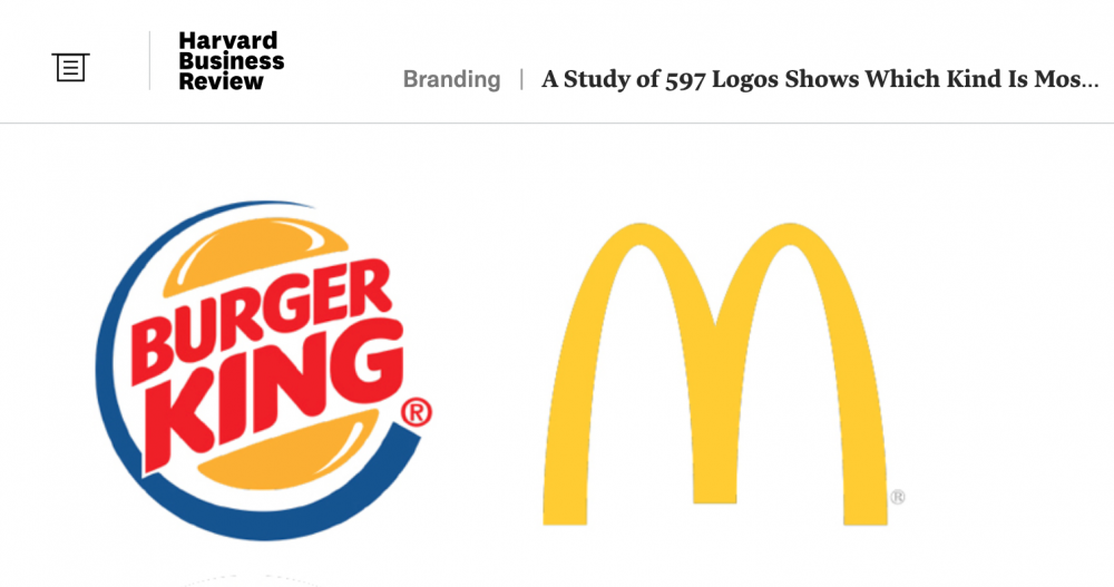
According to a 2019 report from Harvard Business Review, consumers seem to like logos that are descriptive, like Burger King, which includes a burger, than those that are nondescript, like McDonald's, which is represented by the more abstract image of golden arches. The former and often more-detailed category of logos generally has several benefits compared to their minimalist counterparts, including making "brands appear more authentic in consumers’ eyes," and even increasing a company's net sales. So if a company's sleek new rebrand seems sus, you're not alone.

So folks, as we begin binging all of Warner Bros. slate this year on the Nolan-despised HBO Max, try not to let the rebrand get to you. I'm sure they paid big bucks for that.
For more internet nonsense, follow Carly on Instagram @HuntressThompson_ and on Twitter @TennesAnyone.