You Legally Can't Criticize Goldman Sachs With Their Own Font; We Did It With Other Ones

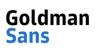
Goldman Sachs, the investment bank, and unwitting inspiration for every orphanage closing baddie in a children's movie, is having a tough year. In the headlines for maybe having to pay over $2 billion just for allegedly participating in the largest fraud in human history, their beleaguered executives would sure like to see some nice things written about them. And what better way to do that than to type those kind words in Goldman Sachs' brand new corporate font? The new Goldman Sans typeface, cleverly named Goldman Sans, is "a clean, modern typeface designed for the needs of digital finance," according to the designers.

And in their typical magnanimity, Goldman Sachs has made the font free to use. With a small caveat -- it's license agreement specifically states: "The User may not use the Licensed Font Software to disparage or suggest any affiliation with or endorsement by Goldman Sachs."
You read that correctly: no naughty words about Goldman Sachs in Goldman Sans -- not that anyone has anything bad to say about a megacorp whose controversies section on Wikipedia's longer than the rest of the entry combined. So let's take an uncontroversial look at the splendid Goldman Sans, and what better way to do that with a non-disparaging, randomly chosen pangram so we can look at each of the 26 beautifully crafted letters?

Utterly stunning! Notice the seamless flow in "fucking zebras." That's a clean finish chairman Lloyd Blankfein's zebra mistress won't be receiving -- in this purely fictitious situation that in no way is meant to reflect negatively upon Goldman Sachs or its executives. But the true test of a font lies in comparing it to other sans-serif fonts (those are the ones where the capital A doesn't have adorable footsies). These can differ both in style and by not having a license that forbids exposing Goldman Sachs horrible practices. Here's the ultimate classic, Arial.

See how Arial doesn't have "chamfered spurs," noticeable in the rigid p's, n's and r's in "paid million-dollar bonuses?" In Goldman Sans, that chamfering would've made the words pop harder, really impressing upon the reader the malicious greed of a company that took over ten billion dollars in taxpayer money and used it to reward the very people who had helped bring about the greatest economic collapse since the Great Depression. Anyways, what about something more distinguished, like Helvetica?

Oh, no contest. Leave it to Helvetica to make a sentence describing how Goldman Sachs' corporate culture encourages them to think about saving lives from a purely supply-and-demand angle look boring and stuffy. Goldman Sans' "neutral, with a wink" style would've made that pure evil cost-benefit analysis look a lot more even-handed and, perhaps, playful. Speaking of playful:

Ah, Comic Sans, you do make things fun, more fun than the terrible, disingenuous electronica from a hack hobbyist who, while firing 5% of his employees, gave himself a $24,7 million bonus to spend on synthesizers and strobe lights and those stupid shutter shades.
But readability is the name of the business font game, and the "raised x-height" in Goldman Sans would make this much easier to read in tiny fonts. Like, say, the one Goldman Sachs used in the fine print of its post-crash federal settlement, which is how they managed to cheat the American people out of nearly a billion dollars in restitutions. Overall, a BBB+ of a font, which is incidentally the only S&P rating these greedy vampires can still attain after decades of fucking over everyone they've ever met.
For more weird tangents in a sellout font, do follow Cedric on Twitter.