What The New Opening Credits Say About 'Game Of Thrones'

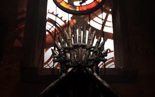
Finally, after way, way too many summers, winter has come. The final season of Game Of Thrones is now underway, consisting of six brand-new episodes of broody fighting and incest. What's also brand-new is the opening credit sequence. Instead of seeing the classic clockwork panorama of places like King's Landing and Winterfell, we now also go inside a madman's diorama, seeing the Iron Throne room and the never-not-creepy hall of Stark ancestors amidst all the whizzing gears and levers.
Fans quickly went to work trying to figure out what the new credits reveal about the new season. But as it turns out, the reasoning is pretty much the same as why we're about to watch six fantasy movies instead of a medieval series about politics: unbridled ambition.
In interviews, GOT title designers Angus Wall and Kirk Shintani of Elastic have revealed that the new approach to the opening credits was much more motivated by practicality than any sort of Easter egg hunt. It's been an intentionally badly kept secret that the credits' clockwork Westeros isn't just for show. It's also supposed to tell viewers where the action for each episode will be taking place and what each weird fantasy place is called (a much more clever solution than the original bird map of the pilot).
But that has become a much less pressing issue in Season 8, what with globetrotting being kept to a minimum due to the handful of remaining characters being clustered into only a few locations. So Elastic was given free reigns to just go nuts. And they did, using some of that $100 million budget to create the kind of detailed, zoomed-in spectacle they've wanted to do since Season 1. They even created a virtual human to make sure all the little buildings were perfectly to scale, and we assume they then had a virtual Jaime Lannister push them off the tallest one to leave no witnesses.
But it's not just all big-budget theatrics. Getting into the guts of the diorama also allowed the designers to get into the guts of the story. It's no coincidence that the more in-depth sequences are the real places of power and story in Game Of Thrones: the broken Wall, the Stark tombs, and the Iron Throne room. Zooming into those on the map is supposed to make things "more intimate," says Shintani, who always wanted to focus on "the places that have the most emotion resonance."
So if the opening credits are still supposed to be a window into the upcoming story, that should put at ease the many GOT fans who have become worried that their show will end up being just another epic fantasy about war, dragons, and boobs (instead of a nuanced exploration of politics, morality, and boobs). Because maybe we should have faith that Game Of Thrones will actually succeed at pulling off both.
For more weird tangents and his personal recipes for toilet wine, do follow Cedric on Twitter.
For more, check out An 'Anonymous Millionaire' Wants To Make 'Fortnite' Real and The Black Hole Picture Spawned The Saddest Conspiracy Theory.
Also, we'd love to know more about you and your interesting lives, dear readers. If you spend your days doing cool stuff, drop us a line at iDoCoolStuff at Cracked dot com, and maybe we can share your story with the entire internet.
Follow us on Facebook. Or don't. It's your life.