8 Movie Posters That Were Way Better In Other Countries

Hollywood seems to treat movie posters as boring afterthoughts these days. Slap a few floating heads in front of a lens flare and call it a day, right? But in other countries, they put so much care into the posters they sometimes overshadow the movies themselves. Let's take a look, shall we?
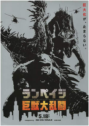
Japan's Kong: Skull Island Poster Emphasizes The Monsters
In America, Kong: Skull Island was advertised as Giant Monster Movie 4027: This Time There Are Some Vague Vietnam Vibes.

But no one watches a King Kong movie for a rumination on sunk costs. We watch them to see King Kong punch other giant monsters right in their giant genitals and/or faces. Japan understood that, and gave moviegoers this:


This Venom poster lazily Photoshopped a bored-looking Tom Hardy and called it a day, and that is a tragedy. You can't even sense any of the vital erotic monster costume tension! But in China, designers boldly stood up and asked, "Hey, what if we made Venom look interesting?"

This poster makes you curious to see the movie. And indeed, Venom was a smash hit in China, circumventing one law that normally limits foreign movies to a run of 30 days, as well as artfully dodging another that prohibits the promotion of male / space parasite love.
Related: The 8 Manliest Foreign Movie Posters Ever
Japan Has Awesome Collectible Minimalist Posters
Japanese movie theaters have chirashi, mini-posters with custom art the size of leaflets. They're only sold while the movie is showing, making them collector's items. Their artwork is usually subtle and minimalist. It's all about getting the movie's themes across in a single image, not merely showing the actors you'll see. So while Americans got an extremely literal American Psycho poster ...

... the chirashi was both artful and creepy:

And both the Rampage and Pacific Rim: Uprising chirashi look like the covers of cool underground comics.

China's Annihilation Poster Properly Captures The Film's Horror
Annihilation is about the exploration of the Shimmer, a mysterious alien phenomenon that mutates the land and life inside of it, threatening the entire world. The whole point of the movie is that the Shimmer is impossibly foreign, something incomprehensible to the point of inducing madness. To portray this feeling to American audiences, they had Natalie Portman stand in someone's backyard with a gun, then slathered a layer of Vaseline over the image.
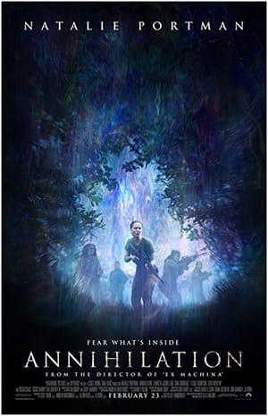
Chinese designers sat down and said, "Look, this is technically a spoiler, but this movie has a murderous screaming mutant bear. You want to see that shit, don't you?"

Related: Lost In Translation: 20 Baffling Foreign Movie Posters
Ghanaian Posters Are Cartoonishly Gory
In 1990s Ghana, artists might have only vaguely heard what a movie was about before being given free rein to draw its poster. You'd think that playing up adventure and sex appeal would be their surefire way to reach the masses, but it was gore. Lots of gore. The result is a collection of bizarre masterpieces that look like torture porn parodies loosely based on blockbusters.

Sometimes the artists did get to see the movie, but that didn't change their approach. Someone once sat down to paint a movie poster and thought, "What's really going to draw people to Jurassic Park is that bit where the T-Rex eats that guy on the toilet. I don't quite remember what the T-Rex looks like, but that's OK."
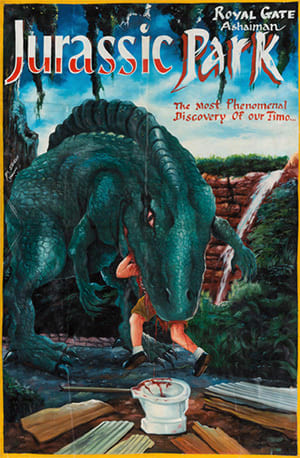
And honestly? They were right.
The Commuter Was Made To Actually Look Interesting
The Commuter, the latest entry in the Liam Neeson Action Grandpa saga, was advertised with all of the enthusiasm that its generic title would suggest. In theory, the film is a thriller in which whatever Neeson's character's name is must solve a mystery in a limited amount of time. To convey this crucial sense of suspense, America got a poster where it looks like Neeson is grumpy about having missed his train. Or maybe they're not letting him on because of the gun.

Since there's no shortage of grumpy-old-white-guy-with-a-gun movies, the international poster instead made The Commuter look like an interesting psychological thriller with some major Hitchcockian vibes.

Related: 14 Hilariously Inaccurate Foreign Posters For American Films
Thor: Ragnarok Was Redone In A Traditional Korean Style
Marvel's instruction to poster designers has always been "Fill space until Photoshop acts up." The Thor: Ragnarok poster at least captures the film's psychedelic vibes, and overall works pretty well:

In South Korea, they decided to play off the film's big gladiator duel between Thor and the Hulk. It does look like the Hulk is caressing Thor's butt, but they are in fact wrestling. It's a nod to Sangbak, a classic work of Korean art from the 1700s which portrays people gathering to watch a wrestling match.


China's Fantastic Beasts Posters Focused On The Beasts
The appeal of a movie called Fantastic Beasts And Where To Find Them should be obvious. You get to look at cool monsters, possibly after receiving a brief lesson on where they can be found. The posters, naturally, focused on, uh ... human characters, like Colin Farrell's Percival Graves. The beasts are entirely absent (with the exception of a subliminal Johnny Depp hiding in Farrell's shell).

In China, meanwhile, they dared to make the movie look fun by showing off the actual beasts and their goofy names.


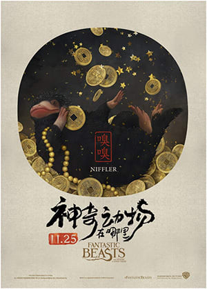
Would you rather see a movie about Percival Graves -- a dude who sounds like he's going to complain that a butler served his tea two degrees too cold -- or about a beast called "Swooping Evil"? Exactly.
If you loved this article and want more content like this, consider a visit to our Contribution Page. Please and thank you.
For more, check out 6 Insane Foreign Remakes Of Famous American Blockbusters:
Follow us on Facebook. And we'll follow you everywhere.