5 Surprisingly Clever Design Choices You Never Noticed

It's easy to take good design for granted, because it enhances an overall experience without calling attention to itself, like Bob Balaban in every movie he's ever been in. But we should take the time to acknowledge all the great things that don't take center stage. Here are five slick design features that deserve to be brought out into the remarkably well-placed light.
Effective Door Use Hinges On Good Design

If you've ever pulled on a push door, pushed on a pull door, or -- god help you -- gotten within 10 feet of those revolving bastards at the airport, you know doors aren't exactly foolproof. But not every faceplant you take into the glass is entirely your fault; it could be down to poor design or, in the case of those auto-rotating ones, pure sadism.

There isn't one part of this entrance that doesn't hate you and wish you death.
Humans naturally want to pull on doors that have big, vertical handles, and they want to push on doors that have plates. A door that gives you trouble is likely to give everyone trouble, because we all walk around with similar expectations about what things we should push (no: "drugs," "your luck" -- yes: "it to the limit").
These counterintuitive doors are called "Norman Doors," after design specialist Don Norman, who criticized them for implicitly telling us to do the exact wrong thing. One of his basic design principles is that item use should be "discoverable" at a glance -- we must know what to do with it without giving it much thought.
Sounds simple enough, but Norman Doors are everywhere. Putting a handle on one side and a push plate on the other is a simple, albeit surprisingly rare, solution to a very easy problem. It's not just you, desperately hungover and stumbling out of EWR, who fails Doors 101:

Some people flunked out at orientation.
Microsoft Uses Games To Train People On Their OS

Windows 1.0 was a total flop, and Windows 2.0 was only slightly more rigid. In fact, before Windows 3.0, most computer users were more familiar with operating systems like MS-DOS. They actually preferred flawlessly typing ornate commands onto a black screen like cyber-wizards, so they resisted the early graphical user interfaces of Windows 1.0 and 2.0.

It's never good when your default interface looks like you downloaded a virus.
What was different about version 3.0? It came with Solitaire. Simple, unassuming Solitaire. As a game, Solitaire has been incredibly successful. It's long been the most-used Windows application, and fans foamed at the mouth when Microsoft took it away in 2015. How else are you supposed to waste time at work? They block all the good parts of the internet.
But Solitaire wasn't meant as a pure procrastination tool -- it was Microsoft's low-key way of teaching people to use their new, high-tech "mouse" technology. Since everyone already understood how the game worked with physical cards, it was the perfect program to teach them how to click (to "pick up"), drag, and drop (release) cards, just as they could do with files and folders.

Provided they could pry themselves away from the thrilling rush long enough to use any other files.
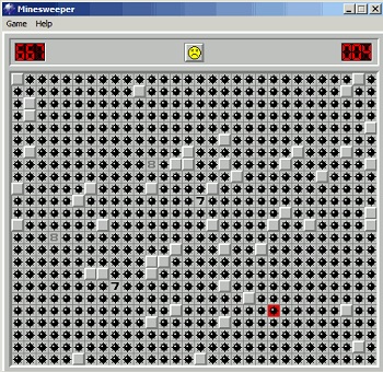
Microsoft took the natural human instinct to avoid work and harnessed it to teach users how to work their new OS. Yep, they gamified the tutorial for their OS 30 years before people started even using the term "gamify." Thanks to the almost-universal acceptance of their treachery, MS added more nefariously educational games in Windows 3.1. Minesweeper, for example, helped users get more accurate with the mouse and taught them the difference between left and right mouse clicks.

Then taught them the exact amount of times you could slam a mouse before it stops working.
Hopefully, developers will remember this lesson when cyberpunk brain jacks become the norm, and Sinister Corp can teach all us stubborn geezers to "mind-click" with the power of Excitebike.
IKEA Exploits Game Design To Keep You From Killing Yourself While Shopping

Navigating your party through an impenetrable, labyrinthine dungeon is a quest every D&D player knows well. Almost as well as IKEA shoppers. This video from PBS Digital Studios shows us how Swedish flat-pack furniture store designers incorporated elements of game design to make their weekend-destroying time sucks more tolerable.
Much like every recent Final Fantasy game, IKEA seems like an open-world experience at first, but it is in fact quite isolated, linear, and full of needless relationship drama. There is a set path to every store, but the idea is that you don't even realize you're following it. IKEA calls their maze "The Long Natural Way." Store routes curve every 50 feet to keep customers on their toes and avoid that boring linear feel. The Long Natural Way makes it difficult to get lost, and yet it keeps your interest. There are even "secret" shortcuts, so you can feel like you're making progress even as you watch your entire Saturday be devoured by plywood end tables.

And unlike Final Fantasy, you can't level up your credit cards after you maxed three of them out.
IKEA also uses language to make their world more immersive. Much like how your Warrior's tiny, ineffectual mace is named something awesome like "Gnomestomper," IKEA goes with incomprehensible Swedish terms for their products to increase the "emotional energy of inanimate objects," the idea being to cause you to be more invested and immersed in them.
And it works. We don't give a shit about "a bookshelf," but "Billy" is a part of the goddamn family.
Facebook Carefully Plans Reaction Types To Tune The Mood Of The Platform
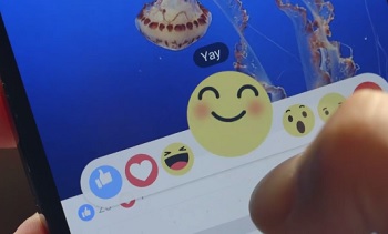
Facebook users have long wanted a dislike button, because at heart we're a hateful and negative people, and a world with only "likes" is a world we want to burn to cinders. What Facebook gave us instead was a set of reaction emoji:

The laughing one is dedicated to anyone who really thought Facebook would give people what they wanted.
Of course, this set of reactions doesn't include the entire range of human emotion (we particularly lament the lack of "exasperated sorrow" and "fuck everything about you"), but it's more comprehensive than "like." And yet half of the new reactions are even more joyous ("Love," "Haha," and the ill-fated "Yay"), only one is neutral ("Wow"), and a mere two of the six possible reactions are negative at all ("Sad" and "Sunburn").
That's not an accident. Facebook hopes that by focusing on the positive end of the emotional spectrum, they'll keep the platform more upbeat and welcoming. After all, they know stories that evoke generally happy reactions are shared more often, and "more shares" means "more money in the hoverboard budget" for joyfully oblivious executives.

Too bad they cut the emoji they'd use to post that feeling.
Of course, anybody who has so much as glanced at Facebook comments can tell you this whole "positivity" thing isn't taking, but the idea is still solid.
Baseball Is Carefully Crafted To Skirt The Limits Of Human Ability

On any regulation baseball diamond, the distance from home plate to the pitcher's mound is weirdly specific: 60' 6". That distance isn't a two-thirds ode to the devil; it's an important design feature. That's the empirically determined balancing point which puts the pitcher and hitter on an equal playing field. Moving the pitcher's mound back even five feet would change the game wildly, giving batters a huge (20 percent) increase in the time they had to prepare their swing, thus leading to more hits, more home runs, and more depressed pitchers.
The distance from the mound to home plate was tinkered with in the 1800s, but it hasn't moved in over a century, because we may have reached the limits of human ability. While it's true that more and more pitchers are pitching in the triple digits, the record for the fastest pitch hasn't moved much at all. The current record goes to Aroldis Chapman, at 105 mph, but when accounting for difference in measurement styles, the record may actually belong to Nolan Ryan in 1974, with his calculated 108 mph, or even Bob Feller, with an estimated 107 mph way the hell back in 1946.

That's apparently the speed at which batters begin to swing like drunken cartoon characters.
Scientists who love baseball almost as much as they love defiling corpses tested cadaver elbows to varying degrees of strain to see what they could take. They found that about 100 Nm (Newton meters) of rotational force is enough to break an average cadaver's ulnar collateral ligament. The torque on an elbow throwing one of those record fastballs? About 100 Nm.
On the batter's side, 60.5 feet is also the minimum reaction distance needed for a human to hit one of those fastballs. Researchers have found the minimum reaction time for most humans in a simple computer game appears to be somewhere around 260 milliseconds. A 100 mph fastball takes about 400 ms to get to home plate. Take away the 150 ms it takes to swing the bat, and you're right in the window for cutting-edge human performance. Technically, there is no impossible fastball -- at least, until we finally pull our heads out of the sand and switch all players out with robots, as God intended.

Look at how awesome it would be if they could fire eye lasers at incoming pitches!
Federico loves writing about science and math, you can tell him to do that for you by contacting him at broccolidog23@gmail.com. Or just tell him how much you love broccoli.
Teachers: America's unsung heroes ... and secret drunks ... and all-around degenerates. To shed light on the dark side of this trusted profession, Cracked Podcast host Jack O'Brien, along with comedians and truTV's Those Who Can't cast members Maria Thayer (Abbey Logan) and Andrew Orvedahl (Coach Fairbell), will interview some real-life (probably anonymous) teachers, who will share all the filthy, outrageous, and hilarious tales from this supposedly squeaky-clean occupation. Get FREE tickets to this LIVE podcast here!
For more unseen genius, check out 19 Cool Design Features Hidden On Stuff You Use Every Day and 15 Secretly Brilliant Reasons Stuff Is Designed That Way.
Subscribe to our YouTube channel, and check out Logo Design: Only As Important As Your Company Is Pointless, and other videos you won't see on the site!
Follow us on Facebook, and let's be best friends forever.
Last Halloween, the Cracked Podcast creeped you out with tales of ghost ships, mysteriously dead people, and a man from one of the most famous paintings in U.S. history who years later went all Jack Nicholson in The Shining on his family. This October, Jack and the Cracked staff are back with special guest comedians Ryan Singer, Eric Lampaert, and Anna Seregina to share more unsettling and unexplained true tales of death, disappearance, and the great beyond. Get your tickets for this LIVE podcast here!

