The 8 Worst Abuses Of Photoshop In Recent Movie Posters

Back in the olden days, well-designed posters were important for telling moviegoers what would give them a good excuse to go to the theater and inhale three boxes of cocaine raisins or lead toffee a few weeks later. But now that the ads before movie trailers on YouTube are other trailers -- and every other post on your Facebook feed is a reaction to those trailers -- posters have taken on the responsibility of the idiot studio intern whose office is a spider-filled broom closet.
The Heat Poster Mutates Melissa McCarthy
The Heat, if you already flushed memory of it from your brain to make more space for Pokemon Go, was a buddy cop movie starring Sandra Bullock and ... M-Melissa ... McCarthy?
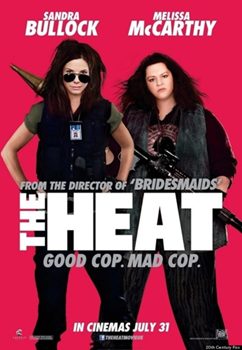
"Yes, it is I, Melis-Sam-Carthy, beloved human entertainer. Can you direct me to our race's most potent weapons?"
Uh, is that Melissa McCarthy? Because she looks like the bass player for a riot grrrl band based out of your local community college. They didn't just touch her up on Photoshop -- they used the "liposuction" filter. Christ, it looks like the "after" photo in a PSA warning kids away from some horrible new drug. Is The Heat about McCarthy teaming up with Bullock to recover her stolen soul?

"Can't we fire her and cast Jenny McCarthy? She's a hoot, and so wise."
The greatest trick Now You See Me (or as it was titled in Europe, Ocean's 11 But With Legerdemain) ever pulled was somehow making $351 million dollars despite the fact that absolutely no one remembers paying to see it. And now there's a sequel, which boldly predicts that movie-goers will again want to root for a bunch of douchey magicians instead of hoping that a disgruntled dove pecks their nipples off. Even the cast looks like they'd rather be getting indicted for tax fraud than be forced to spend another moment working on the movie.

Mark Ruffalo looked way more jazzed on the poster of a movie about child molestation.
Morgan Freeman looks like his granddaughter insisted on playing dress-up with him, even though he was not in the mood. And poor Michael Caine just needs a hug.

"What Harry Potter number is this, anyway?"
Can't you hear the long sigh he was in the middle of? It also says a lot that the most enthusiastic cast member yet is the one you probably can't name. Forcing the whole gang to stand together only makes their misery coalesce into some next-level sadness -- kind of like when The Smiths were still together.

Even the guy who was typing the name of the movie gave up and mashed the keyboard, apparently.
Money is literally raining on them, yet they look like they've been told that their best friend drowned trying to save their puppy (who also drowned). Not seeing it? Let's zoom and enhance:

They look like they're lining up to record a PSA about prenatal Alzheimer's.
There are seven very talented actors and a Dave Franco on that poster, and they've collectively been able to summon as much enthusiasm for their new movie as an ultra-orthodox Hutterite community who thinks happiness is a sin to begin with and who've learned that their butter churn burned down. Daniel Radcliffe is actively holding back tears, Morgan Freeman's doctor has informed him that his new medication causes erectile dysfunction, Jesse Eisenberg is in the middle of having Batman V. Superman reviews read to him by a stern nun, and Lizzy Caplan looks like she's being auctioned off as human chattel by the Russian mob. Maybe moving them off to some wacky locale will help?

When will Michael Caine learn to stop locking people in water tanks?
OK, so we don't want to alarm you, but it seems John Travolta recently merged with Arnold Schwarzenegger to form some sort of Food Terminator.

Does ... does Scientology have those powers?
But seriously, is this a low-budget Face/Off sequel? Because it looks like they stapled Travolta's face onto one of those foam heads you keep wigs on. To be fair, since no one has watched a John Travolta movie since Hairspray, you could tell us that he now looks like a beautiful Filipino ribbon dancer and we wouldn't immediately dismiss you. We're like 70-60-percent confident that his head hasn't shrunk into a peanut, though. And yet:
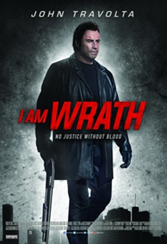
"This summer ... John Travolta is .. ZIPPY THE PINHEAD."
Why is Travolta's head so tiny if he's big enough to stomp on all those buildings? And why did his hair change color? Is that his stompin' 'do? The hair reverts to its original color in the next one, but ...
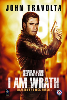
We take it back. This movie doesn't know what humans look like.
OK, now it looks like he unhinged his jaw, ate a watermelon whole like a vegan snake, and is slowly digesting the melon in the place where his brain used to be. Is John Travolta slowly evolving into an Easter Island stone head? Is he going to get his revenge by headbutting criminals to death? Because we would watch that. Everyone would watch that.
This Poster ForThe intern who made the international poster for Chef clearly read the plot synopsis as far as the word "chef" and decided he already knew everything he needed to know. "Chefs wear hats ... while they make food ... food makes me hungry ... I've got it! I'm going to Arby's!" Then a spunky (but dead) rat in the studio parking lot finished the job.

Iron Man 2 was weird as shit in Mexico.
Why is Jon Favreau's disembodied head floating above the rest of the cast like a culinary Zordon? Is Dustin Hoffman trying to call our attention after having suffered a stroke? Why is he wearing a chef's outfit when he's not even a chef in the movie? Why does that question also apply to Sofia Vergara? And also to Robert Downey Jr. -- who, in addition to not being a chef, is only in the movie for a few seconds longer than the viewer? Why does he look like he's about to beat a man to death with that rolling pin?
The Trust Gives Elijah Wood Two Thumbs (On The Same Hand)
Hey, so it looks like Nicolas Cage and Elijah Wood have formed an '80s European synthesizer band, which we're going to go ahead and assume is called Der Woodcage.

"And good actors make the worst movies."
Wood's face looks more Gollum-ish than we're accustomed to, but let's focus on his hands. They look weird, right? Like he's wearing really bulky gloves or something? Zoom and enhance!

Macaulay Culkin's mom chose wrong.
Oh, he has two thumbs. On one hand. Nicolas Cage, what madness thinly disguised as a movie has your deal with the devil gotten you into this time, and why did you and your ridiculous mustache drag poor Frodo into it?

This is actually the exact same image as before, with Cage removed.
The shot from the movie they built the poster from shows Wood holding his gun like a person with the normal amount of appendages, so we guess they felt the need to ... correct that? They even chopped his original thumb off at the knuckle, in a bizarre attempt to disguise their mad science, which only makes it look more unnerving. Anyway, this is now the most anyone has ever written about this movie, so congratulations, producers. Your plan worked.
Jake Gyllenhaal Is An Anime Character
This poster for Accidental Love, which we believe is from Kenya, looks cute enough at first glance.

It has all you want in a romantic comedy: ritual heart extractions, deer-men, nail guns to the head, etc.
But if we de-twee it by flipping Gyllenhaal right side up ...

As we're legally obligated to, since looking at a U.S. flag the wrong way is criminal and anti-American.
... we suddenly have anime eyes on a real human man. Our best guess is that it was meant to improve the perspective on wacky horizontal Gyllenhaal, but even then it looks like the sight of the girl freaked him out and he's about five seconds away from shooting steam out of his ears. At least they didn't give him a nosebleed and a body pillow.
This Teen Dance Movie Looks Like A Horror Film
High Strung is about a dancer and a violinist from different worlds, united only by the fact that no one believes in them. But, at the risk of giving too much away, they believe in each other.
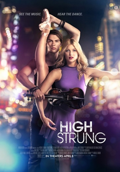
Did ... did she give birth to that violin?
And judging by the upbeat, inspirational trailer, there probably isn't a third act twist in which Not-Taylor-Lautner turns out to be a sociopath who rips his co-star's leg from its socket and holds it behind her back like a grim hunting trophy. We're also pretty sure that she must be a cyborg, because anyone else in that pose would be screaming in agony, not looking like she's daydreaming about an extremely forgettable bowl of tapioca.
The foreign poster is even worse ...

"Now with more Cool Ethnic Friends! At the same low price!"
... because covering up the bottom part of the image makes it look like he's 100 percent a cannibal manhunter, dangling an unrelated severed leg behind her.
The Aliens Are Drunk As Hell In Independence Day 2
Holy fuck, did someone really pay for these Independence Day: Resurgence posters? Are the aliens crashing straight into the planet? This doesn't look like the threatening annihilation of Earth's greatest monuments; it looks like the intergalactic equivalent of a M.A.D.D. commercial.


Even in outer space, the Fourth of July is a horrible weekend for DUIs.
Do these landmarks have architectural leprosy? There are no evident weapons being fired, and the ships haven't completed their douchey parking jobs yet. But never mind that -- let's take a closer look at the destruction being lazily wrought:

"Oh thank God. My shoulder was killing me."
We've recently covered the fact that the Statue of Liberty is a lot flimsier than people imagine, but we didn't mean, like, papier mache flimsy. It does not shatter like a pint glass that's been knocked off a bar table during a passionate argument about, say, movie posters. It collapses, warps, or makes a single clean break. Physics 101 is being ignored in the City of Lights, too:

By the way, if the ship is flying low enough to do this, the whole city just died.
The Eiffel Tower is made of some mysterious substance called "iron," which doesn't shatter like a nacho. So either whoever designed these posters was raised in a windowless basement and got the job as part of an effort to integrate them into wider society, or they lazily cut and pasted a chunk out of the building to imply horrifying(ly illogical) destruction. Although it would be a solid sequel hook if the aliens have returned to Earth with weapons that shatter reality as we know it.
Mark is on Twitter and has a book.
Zoroastrianism used to be one of the biggest religions in the world, but their idea of heaven had a slight twist on it: To get there you'd have to cross a bridge, sometimes rickety, sometimes wide and sturdy. If you fell off, you'd go to the House of Lies for eternity. Fun! Not terrifying at all! This month, Jack, Dan, and Michael, along with comedians Casey Jane Ellison and Ramin Nazer discuss their favorite afterlife scenarios from movies, sci-fi, and lesser-known religions. Get your tickets here, and we'll see you on the other side of the bridge!
Also check out 9 Baffling First Drafts Of Classic Movie Posters and 8 Classic Movies With Shitty Posters.
Subscribe to our YouTube channel, and check out 8 Great Movies With Insane Deleted Scenes, and other videos you won't see on the site!
Also, follow us on Facebook, and let's be best friends forever.
