The Secret 'F**k You' Before Every Modern Film

The first 60 seconds of Star Trek Beyond was made up entirely of studio logos. Trust me; I counted. That's enough time to scald a Hot Pocket, all devoted to plugging five separate brands, from Paramount Pictures to J.J. Abrams's Bad Robot production company.
Movie fact: "Bad Robot Production" was the working title for Pacific Rim.
And as everyone who still plops their butts in theater seats knows, this observation isn't revolutionary. Along with 20 minutes of pre-roll ads, 10 minutes of lights-down ads, and another 20 minutes of trailers, we're now getting a slow influx in the amount of studio logos that appear before a feature film. And while that addition might not seem much to wave your fist about, eating shit is still eating shit, no matter how little shit you're eating. And I'm here to tell you that these logos are, in fact, shit. I'm talking dried, lumpy butt-slugs being contemptuously dangled in your maw like some kind of netherworld mistletoe.
I'll explain ...
To understand this, you need to know why it's happening in the first place. And as Flavorwire details, you can track the trend of endless logos back to Days Of Thunder and that "Don Simpson / Jerry Bruckheimer" lightning bolt which appeared before the opening roll. You know the one.

Unnecessary flash from Jerry Bruckheimer? Never.
Until that point, smaller production companies, like Spielberg's Amblin, usually had their logos appear at the end of a film, allowing the single major distributor to headline the show and keep the credits moving along. But as the '80s and '90s saw a rise of iconic producers like George Lucas and the Weinsteins, more and more subsidiary logos began flooding the preamble, like a parade of shitty opening bands.
This created a problem, as your average Hollywood film is created with a web of distribution and financing companies, making it stupidly impractical to visually acknowledge every single one.
Dimension Films is owned by The Weinstein Company, which was once owned by Disney, which now owns Marvel (which just partnered with Sony on Spider-Man) and Pixar. Summit Entertainment is owned by Lionsgate (which once co-produced a film with both Marvel and Artisan), which co-finances movies with Warner Brothers ... which also owns New Line Cinema (which co-produced Blade with Marvel), DC, and Castle Rock Entertainment. Castle Rock got its start working with Columbia Pictures, which is owned by Sony, as is Screen Gems (which has co-produced films with Miramax) and Tristar. In case that's confusing, here's a handy graph I made:

And this isn't including countless other major production companies I was too lazy to include, nor the single celebrities and directors who run their own separate companies. Quentin Tarantino established A Band Apart, Brad Pitt has Plan B, Spike Lee runs 40 Acres and a Mule, and Adam Sandler co-owns Happy Madison with the help of Netflix and probably some blood pact with the Dark Son of Morning.
And so as more small companies began putting vanity logos before their films, the more everyone wanted a piece of that prestige pie. And it wasn't enough to simply toss a still image before a film; you had to make your gaudy mark. Suddenly, that aforementioned Bruckheimer logo now looks like a shot from the gritty Roadrunner prequel that's probably getting made as we speak ...

And will probably be titled The Runner Of Roads by some asshole in marketing.
Longer, flashier, more CGI! Thanks to advancements in technology, this was the first of several upgrades that studio logos underwent between the mid '90s and early '00s. Paramount Pictures went from a simple animated mountain to a swooping God-shot through majestic clouds ...

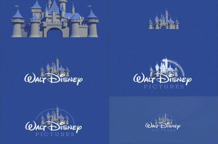
... Disney went from their nostalgic '80s logo to a 3D extension of Toy Story ...

... and Universal Studios tossed the model globe in favor of a CGI diorama of the fucking rapture.

But it wasn't over. Because as CGI got better in the late 2000s, we saw yet another update with even more elaborate camera swoops ...

... detailed environments ...

... realistic lighting ...

... and balls-stapling audacity.

The 2020s version is going to be a 90-minute Planet Earth-style documentary showing the lion from birth to becoming the logo.
Some of these needlessly complex sequences probably cost more than the films they precede -- all so that little-known companies like Walt Disney Pictures make sure you remember their brand. This change affected every studio, from gigantic to independent. And as the logos became more elaborate, they also got longer. Paramount's intro went from 15 seconds to 20 in 2012. Universal's started as 10 seconds in the '80s, then 19 seconds in the '90s, and finally 22 seconds in 2016. And Disney, a company whose logo was originally eight seconds long, climbed all the way up to a masturbatory 30 seconds in 2006.
So instead of keeping things brief and to the point, the logos were getting bogged down with annoyingly long run times. Simple and elegant designs were replaced with distracting camera movements and overused CGI.
If you haven't noticed yet, this is a perfect goddamn analogy for everything problematic with modern blockbusters.

Movie fact: This will be considered "subtle" and "quaint" five years from now.
The problem was right there in front of us all along: more and more grubby hands hijacking films with their own elaborate short-form spectacles. And meanwhile, actual opening credits became less and less common.
Yeah. Remember opening credits? Films like Honey, I Shrunk The Kids and Four Rooms would actually make entire animated sequences devoted to them. Others would intermittently inject them within the first 10 minutes of the film. And while they are still kicking around, more and more films have opted to get rid of them altogether. And while you might say to yourself, "Good, that's more time spent on the actual story," you're forgetting the part about Star Trek Beyond including a full minute of company logos instead of having opening credits.
In other words, we've taken the list of deserving artists and craftspeople who used to headline a film and replaced it with a flashy assortment of corporations and executives tripping over each other to share credit for other people's work. And the worst part is that audiences don't seem to care ...
In fact, they actually applaud and fight over these brands.


Note: DC recently announced they're changing their logo from this one, which they've used for all of four years.
LucasFilm or Marvel or DC don't need you to cheer and support them; people do. The individual producers and writers and directors who made the things you're watching -- those are the artists who deserve a full minute of credits before a film. And any studio that cares more about congratulating itself in a film's first minutes clearly doesn't respect all the minutes that follow.
So let's cut the studio vanity and bring back the goddamn opening credits. But not like ... those insanely long old-timey opening credits. Those were super boring.
Last Halloween, the Cracked Podcast creeped you out with tales of ghost ships, mysteriously dead people, and a man from one of the most famous paintings in U.S. history who years later went all Jack Nicholson in The Shining on his family. This October, Jack and the Cracked staff are back with special guest comedians Ryan Singer, Eric Lampaert, and Anna Seregina to share more unsettling and unexplained true tales of death, disappearance, and the great beyond. Get your tickets for this LIVE podcast here!
Also check out 6 Harsh Truths The Movie Business Needs To Face and 5 Unwritten Rules Hollywood Needs To Stop Following.
Subscribe to our YouTube channel, and check out Why Hollywood Can Lose Billions & Still Make Terrible Movies, and other videos you won't see on the site!
Follow us on Facebook, and let's be best friends forever.