Classic Movies That Had Awful Posters

Some movie posters are as renowned as the movies that originated them: ET biking through the moon in ET. Jodie Foster eating a moth in Silence of the Lambs. Jean-Claude Van Damme flexing his right arm in every movie he's been in. You know a poster has done its job when just hearing the name of the movie makes you think of it.
But sometimes, the opposite happens: we hail a film as a classic for the ages, completely forgetting that the original poster looked like butt. Not even a good butt. The butt of someone created by people who have no idea how to design posters. I don't know how the following movies ever became famous when the first thing most people saw about them looked like this:
Groundhog Day -- Bill Murray Lives Inside a Clock

The Classic Movie:
The epic, 10,000 year-long story of a man stuck in time who must cope with immortality and his own dickishness. Although it wasn't appreciated at first (our brains weren't fully evolved back in 1993, as evidenced by The Nanny's inexplicable popularity), Groundhog Day is now seen as the turning point in Bill Murray's ascension from funny actor to mythological figure. This movie is one of the greatest accomplishments of our culture.
The Shitty Poster:
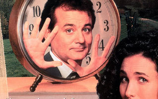
And that poster is one of the worst. I want to send a squad of Terminators back in time to the meeting where that poster was decided. It must have gone something like this:
"So, what's the movie about?"
"Bill Murray is stuck in time and ..."
"Stuck in time. OK. Put him inside a clock."
"Literally inside the clock?"
"Yes, and obviously the clock has to be unrealistically oversized in order to fit him. But not all of him. Just his head. Meanwhile, Andie MacDowell is also there and doesn't give a shit that Bill is clearly pleading to be let out."

"I, uh, was thinking maybe something with the groundhog would make se-"
"Do this, or I will put a turd in your mouth. I swear to God."
The worst part? Like Murray himself in the movie, they had a chance to repeat this moment and fix their mistake. When the anniversary DVD came out, that was the perfect opportunity to pick a non-terrible cover. Instead, they went with this monstrosity featuring a dead-eyed Bill Murray doppelganger holding up the clock/prison that the real Bill is trapped in, and pointing at it as if saying, "This will be you soon."

Fight Club -- Brad Pitt Really Wants You to Get Clean

The Classic Movie:
A movie about punching and explosions and subliminal genitalia, with a twist ending so great that it ruined twist endings forever.
The Shitty Poster:
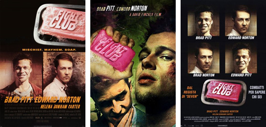
And soap. It's also about soap, as the poster would like you to know above all else. Some higher up saw this movie, an experience akin to overdosing on testosterone, and said, "You know what I liked about it? The part where they talk about soap. Let's make the whole marketing campaign about that." As a result, it looks like Brad Pitt is telling you to wash your ears, because Brad Pitt heard you can get an infection for not doing that, and Brad Pitt is super worried about your personal hygiene. Edward Norton, on the other hand, just likes being smug.

And it wasn't just that one poster: most of them featured soap prominently ...

... or, in some cases, that's all they showed. No explanation. Just soap.

Now, soap is a key element of the movie's plot (they use it to make explosions), but it's only mentioned in a handful of scenes, so it's weird that it's been given more promotional importance than, say, the ubiquitous cups of coffee, or Helena Bonham Carter. Also, once again, they use it to make explosions. There's another thing they could have used in the posters instead, right there.
The French Connection -- Gene Hackman, a Hobbit, Witnesses a Religious Experience

The Classic Movie:
A cop thriller so badass that, for the chase scene, they just shot Gene Hackman driving against traffic in a real street and put that in the movie. Yes, they broke the law to film a movie about a cop, who would undoubtedly pump some lead into your ass for doing just that.
The Shitty Poster:
If you ignore Hackman shooting at the guy, which is easy to do because from that perspective he looks like a leprechaun that wandered into the set, this is clearly a photo of a man dropping to his knees as he experiences some sort of religious conversion. He was just running some errands one day, when it suddenly hit him that God is grand.

Seriously, why would you put the focus of your poster on some random jackass getting offed instead of the mofo doing the offing? "Gene Hackman shooting guns" is the biggest selling point here. I think the expression on Hackman's face in this photo (which they had to awkwardly insert into the title to let you know he appears in this movie) says it all:

MASH -- A Giant Hand with Legs, For Some Unfathomable Reason

The Classic Movie:
This is a movie about the Korean War, starring army doctors who deal with death every day, with a theme song about suicide ... and, against all odds, it's fucking hilarious. So hilarious, in fact, that a movie alone couldn't contain the hilarity, and it spawned a TV show that lasted more than twice longer than the war the characters were supposed to be serving in. Yes, they kept a war going for a decade because it was so funny.
The Shitty Poster:
There's literally only one conversation that could have led to this visual mindfuck:
"Alright, we have to make a poster for this movie, but they didn't send us the plot synopsis. Let's start!"
"Sure thing. What's it called?"
"MASH. Oh, and Donald Sutherland is in it. That's all we know."
"Sutherland? Wasn't he in Invasion of the Body Snatchers? It's probably a horror movie."
"No, this is 1970, that hasn't happened yet."
"Well, it's probably a horror movie anyway. I'm guessing it's about a mad scientist who 'mashes' together different things into hideous monsters."
"What things, for example? Let's use our creativity."
"Uh, how about ..."

"... hands?"
"Great. And what else?"
"H-Hands?"
"Something that isn't hands."
"Legs!"
"Perfect. We'll draw a hands/legs mashup monster. They'll love it."

Half an hour later: "Hey, guys? It turns out they did send us the plot synopsis: it's a movie about the army. What do we do now?"

"Problem solved."
The Descendants -- George Clooney is a Pervert at the Beach

The Classic Movie:
Is The Descendants starring George Clooney a classic? To me, yes, it absolutely is, because it's 4 a.m., and I'd like to finish this column at some point. In all seriousness, this Academy Award winning dramedy co-written by the Dean from Community deals with issues like family, and responsibility, and betrayal, and ... OK that's probably enough words about this one.
The Shitty Poster:
Hey, so, I'm not crazy for thinking this poster is specifically designed to make George Clooney look like a potential child molester scouting the terrain, right? He's clearly sneaking a peek at those teenagers and trying not to look suspicious, but the "rubbing his hands together at the thought of those firm young bodies" part sorta gives him away. The kids are blurry because they're not people to him: they are objects of sexual gratification.
My best guess is that the real idea behind the poster was "George Clooney keeps an eye on his daughter and her boyfriend, so they don't have sex (thus giving Clooney descendants);" but, instead, it looks like he's the one about to rub one out. There's another poster that shows him looking in another direction:

And yet another where he's sitting in such a way as to conceal his boner:

In conclusion, I'm pretty sure Clooney slept with the designer's wife (or someone in his family, anyway).
The Italian Job -- This Tea-Sipping Mobster Accidentally Drew His Heist Plan on a Lady

The Classic Movie:
Not only one of the greatest heist movies ever, it also contains one of the best one-liners put to film. Michael Caine and pals want to steal some gold passing through Italy before the Mafia can do it, which they successfully pull off through cleverness and funny accents (at least until the infuriating cliffhanger ending happens).
The Shitty Poster:
Well, no wonder the Mafia lost: due to some staggering oversight, they wrote down their heist plan on some lady's back instead of on a piece of paper, or any other easy to carry medium. Whoever dropped the ball there must have felt awfully embarrassed when someone pointed out the mistake.

It should be noted that this poster was only used in the US: in England, it had a more sensible one highlighting the car chasing and Michael Caining you could expect from the movie, and it was a hit. In America, on the other hand, most people apparently thought the poster was advertising a career as walking stationary, and it flopped.

Caine himself blamed the flop specifically on this image. Not that his presence on a poster is a guarantee for success, though ...
Victory -- The Stallone/Caine/Pele Abomination

The ... Classic Movie?
I'd never heard of this movie before, but apparently it uses famous footballers instead of actors, so I'm sure it's really good. It's the true-ish story of a bunch of Allied POWs forced to play an exhibition match of soccer with the Nazis. This is exactly why the Geneva Conventions exist.
The Shitty Poster:
Gah!

"KILL MEEEEE ... I MEAN, UUUUUS ... I MEAN, GOOOOOAL."
Apparently, the Allies lost the match and as a result, they were handed over to Josef Mengele for experimentation. Mengele then turned three of them (played by the unlikely trio of Michael Caine, Sylvester Stallone and Pele) into an abomination with three heads and three arms but one torso, and presumably a single pair of legs. The prisoners' only request was that the lower section be Pele's, for obvious reasons.

Upon closer inspection, you actually see the part where Stallone's torso separates from Caine's, but the fact that the shirts are the same color and that they're all standing so uncomfortably close still makes it too easy to see them as some sort of creature of myth. Thankfully, Egypt had a simple yet elegant solution to this problem:

The Shining -- That Face. That Fucking Face.

The Classic Movie:
Yep, "a masterpiece of modern horror" sounds about right. This is a movie about, in no particular order: a hotel possessed by ghosts, a father who goes nuts and tries to axe his family, a kid and a cook with mental powers, a sadistic director psychologically torturing an actress, and a man in a bear suit fellating a dapper gentleman.
The Shitty Poster:
So why is that the poster? There's a lot of weird shit in this movie, but an orgasming ET isn't one of them. Is my memory blocking a whole subplot about Jack Nicholson getting abducted by aliens and then fucking them? Because, come to think of it, that does sound like something that would happen in a Stanley Kubrick movie (I'm imagining a combination between the fast-forward threesome in A Clockwork Orange and the space bedroom in A Space Odyssey).
Another explanation: this is a rage comic that got displaced in time through some Kubrickean plot twist.

Otherwise, who the hell is that supposed to be? Shelley Duvall? Scatman Crothers? Stephen King? Oh God, is this the face inside the bear suit? That would explain why the mouth is wide open.
Maxwell Yezpitelok has a free comic you can read and a Twitter you can follow.
