5 Vintage Ads Ripped Directly From Your Nightmares (Part 2)

When the aliens, robots, or sentient bacteria finally take over and start sifting through the rubble of the scorched trashball that was Earth, they're going to eventually come to the conclusion that our destruction was a mercy killing. Why? Because the Charmin bears have shoved their poop-stained asses in our faces for years and we haven't attacked their corporate headquarters with pitchforks yet.

HOW DID YOU EVEN GET POOP IN THOSE SPOTS, YOU NASTY DUMMY?
What's really crazy is that the Charmin Bear campaign is only the latest in advertisers' ongoing war on our sanity.
Elsie the Borden Cow Was Trapped in a Domestic Nightmare

Most of us are familiar with the concept of the uncanny valley -- the point where robots are just realistic enough to elicit repulsion from real humans. As far as I'm concerned, we don't need a robot revolution to hit that wall -- all we have to do is reacquaint ourselves with Elsie the Borden Cow and her insane bipedal family. During the mid-20th century, consumers didn't just get the vapid, bodiless smile of the Borden mascot that you're probably familiar with.

She seems a little too happy for someone whose neck ends with a floral arrangement.
No, they got Elsie's whole family. All five members, each more unnaturally bovine than the last. The idea was to sell milk with a regular all-American family who provided the milk from their own teats. Except the boys, obviously. It just so happened that this family lived under the constant cloud of their father's unquenchable anger.

The original inspiration for the movie Raging Bull.
With every ad you got the sense that you were looking at a scene 10 minutes before the cops and assigned social worker get their nightly call for an intervention. Elmer the Bull's muscles are always tensed for a backhand, and Elsie carries herself with the placating ease of a woman who is afraid of getting hit at any second. And the crazy part? It must have worked. Borden stuck with this PSA of an ad campaign for years.

Got domestic violence?
7-Up Was Constantly Thwarted by Human Faces

Look, I get that advertising is a tricky business. But how hard is it to get pretty humans to guzzle effervescent sugar water for money? I may not be "spokesmodel material" myself, but I certainly know what "drinking" like a "human" looks like, and this isn't it.

It would help if we could see his tiny invisible straw.
Apparently, 7-Up went through an achingly long stretch when the very act of drinking was a mystery yet to be solved. Do people enjoy beverages through their eye holes or cheekbones? According to this 7-Up ad, maaaaaybe?

Good lord, he thinks it's a flower.
Do you like to picture old men on the verge of fellating a soda bottle? NEITHER DO I BUT HERE WE ARE.

Don't you wish I didn't bring up the fact that he's also softly humming and pantsless?
The best part? 7-Up actually used one ad to capture what it looks like to view an old-timey 7-Up ad. Look at the guy's expression:

I agree.
Maxwell House Took a Weird Premise Too Far

You know you're looking at a bizarre campaign when its backstory takes five minutes to explain. The Maxwell House ad above happens to fall into that category. I could go through the whole thing: how Maxwell House used actors from the popular Broadway hit Showboat to shill their wares, how sometimes that meant using white actors in blackface, and ... never mind. That about covers it.

Yep.
As horrific and unfunny as minstrelsy is, at least we have a little background to understand why Maxwell House used blackface characters to sell their coffee. What we don't get background on is why an old man clearly on the cusp of dementia is captaining a large boat. Or why the subject of coffee requires the seriousness of a man explaining brain cancer.

Nor does the fact that this is an actor playing a specific character explain the dialogue "Coffee is like a friend, Tiny," which is something you'd expect to hear on the last day of your life in prison. We can only hope the other guy's character is Tiny. For all we know, it's Mike, and this is just one more way we know Captain Alzheimer is losing it. Look at the other guy's face. This is the exact moment when he realized he should have researched maritime law and riverboat murder.
Vintage Brands Can't NOT Use Terrifying Children

I love kids as much as the next person, maybe more, because my heart is pretty big and my womb is bigger. But even I know that with the right lighting and a bad mood, kids can go from cute to creepy in a heartbeat. This explains why all the best horror movies feature children: The Omen, The Exorcist, E.T., etc. As anyone who's ever watched a Danny DeVito movie knows, just because someone is small doesn't mean they're cute. Perfectly adorable kids might turn into a Children of the Corn once you get your delicious product in front of them, which is apparently what happened in this Log Cabin Syrup ad.

You can't tell if its syrup or the blood of their enemies.
It doesn't help when your actual product is so nasty that the kid/teen/small lady in your ad is so disgusted that she's suppressing a gag as she struggles to consume it. The girl in this ad for meat paste is daring you, the consumer, to make her swallow whatever mush she's managed to keep in her mouth up this point. Look at her eyes. She hates you for doing this to her.

This was actually an ad for how suicidal mothers can get their kids to kill them and get it over with.
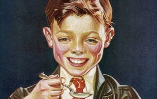
Dead eyes are one thing; you can kind of give the kids a pass for a having a bad day or being actual corpses whose eyes are propped open by strands of floss tied to the back of their head or whatever. For some advertisers, capturing a weird moment with a kid and sticking their name on it isn't enough. For them, the ad isn't done until they've got a tiny murderer shilling their product. If your smile is so creepy that everyone automatically assumes you've got dead bodies on your person, you might not be the best spokesmodel. Buddy, for example, probably should have toned it down a bit for Colgate.

"Buddy has a girl chained to the radiator" is more like it.
Let's say Buddy was the victim of some unfortunate phrasing. Let's imagine Colgate's first draft was "Heavens! Buddy is secretly Ron Howard!" or maybe "Jeepers! Buddy brushes his teeth with a horse brush!" Not so creepy anymore. The next ad has no excuse. Kellogg's went out of their way to find the kid version of Steve Buscemi, STARVED HIM to the brink of death, put a suit on his skeletal frame, gave him food for the first time in two weeks, and made an ad out of his pathetic reaction.

Nope.
Maidenform Turned Your Nightmares into Their Ads

I can list three things we can all agree on: boobs, and dreaming that you went outside your house in your underwear is a nightmare. Dreaming that you went to school or work or anywhere other than your bathroom in your panties and bra is your brain's way of saying "Not so fast, hot stuff. You're still a freaking joke, and everyone knows it." The bra manufacturer Maidenform took two of our worst fears (showing up somewhere naked and visiting new places) and turned them into a decades-long ad campaign. For example, the ad copy attached to the picture below was "I dreamed I was an Eskimo in my Maidenform bra."

Guess who? Bear rape.
The weird part was that the women in the campaigns were all thrilled to find themselves in Dali-esque horrorscapes, as if suddenly appearing in the Arctic in a bra and a slip wouldn't mean an immediate dream-world death sentence and a real-world trip to the therapist the next day. Yes, I appreciate the whimsy of the campaign, not to mention the fact that Maidenform probably Inceptioned their bras into thousands of insane nightmares, but come on. The picture below isn't an ad, it's the world's most stylish suicide attempt.

"Chief, we're on hour three of her singing Miley Cyrus' 'Wrecking Ball.' We think she's a jumper."
And some of the women in the ads aren't just happy to be displaced and semi-naked. They're really happy to be displaced and semi-naked. As in sexually happy. (In their private parts.) (Where the orgasms happen.)

The hip cape makes the lower half of her body a superhero.
The best ads were when Maidenform got their signals crossed and the model didn't quite know what emotion she was supposed to convey. If you found yourself lost and half-naked on a foggy London night, you'd probably be a little concerned. Frightened, even. Or, if you're an exhibitionist, thrilled. Terror or elation would be written all over your face either way. The look you probably wouldn't be going for while missing your shirt in front of Big Ben is "sleepy."

Maybe she smells bacon?
Throughout the campaign, Maidenform depicted semi-naked women crossing the Nile, popping out of a jack-in-the-box, going to the circus, being a lady editor -- hey, wait a minute.

That one's just a little too on the nose, Maidenform.
Kristi is a senior editor and columnist for Cracked. For more from her, check out past articles here and follow her on Twitter and Facebook.
