5 Disturbing Old-Timey Ads Obviously Created by Aliens

Thanks to Mad Men, we assume that all old-school advertisers had one hand wrapped around a highball and the other on the pulse of America. But if you look hard enough, the actual advertisements of the era suggest otherwise. Instead of hitting the heights of sophistication, plenty of vintage ads demonstrated a barely passing understanding of what humans look like or how their bodies work. It's almost like there were whole advertising offices infiltrated by aliens pretending to be humans and these ads are what they threw up at the end of the day.
It's only in looking back that we see how hilariously the alien admen failed. For example ...
Human Laughter Doesn't Look Like That

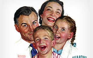
Don't you hate it when you hear a great joke while simultaneously eating a golf ball? Isn't it the worst when someone makes an oil painting of your stupid face as you're choke-laughing? Doesn't it make you mad when the person painting your picture is famed Americana illustrator Norman Rockwell, and also when three members of your family are surgically grafted to the back of your head?
I'm going to stop asking these questions, as the head waves of acknowledgment are starting a hurricane and my house is ill-prepared for the wind onslaught.

This girl knows what I'm talking about.
Today, we're so quick to hit the camera's delete button that our most unflattering pictures are gone before our brains can even register them. Raucous laughter only counts if it's photogenic, because who wants a record of that time their face made 14 chins? This is why it's kind of weird that old-school advertisers thought disquieting images of people laughing would sell their products. Not polite chuckling. Not pretty smiling or, God help me, smizing. These were wide-eyed, open-mouthed guffaws that are unnatural to anyone outside the dentist's office.

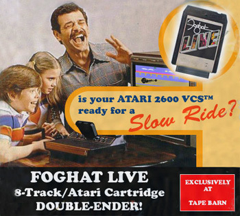
Listen up, kids! This sexually charged rock song is HILARIOUS!
Like the word "Foghat," nothing in the ad above makes sense. The little girl looks like the TV farted in her face, and the boy has got to be playing some amazing game that couldn't have possibly existed at the time. The dad is either reliving some 'Nam shit or doing something dirty with an invisible lover. Either way, inappropriate.
I can understand the instinct to associate a product with fun and hilarity, even if the execution is an unmitigated mess of contorted faces. What I can't understand, and will never understand, is this:

Nope!
Imagine Don and Peggy presenting this drawing to the Canada Dry people: What's really going to sell your drink is a cross-eyed, double-chinned redheaded kid having a stroke! And heeeeere he is! (Produces illustration/simultaneously cleans up the vomit in the conference room.)
I've been trying to make this exact face in the mirror for 30 minutes, and all I've learned is that it's physically impossible and that ginger ale can go back to the hell it came from.
Ads Shouldn't Horrify You into Buying Something

Look, I work on the Internet. I get the instinct to shock and tittylate the masses for attention. Sometimes you get readers with cheesecake (tittylating), and sometimes you get them with scary ads that would have worked better as advertisements for my nightmares. For example, check out this ad with this sexy lady in her red velvet cake of a car.

Judging by the scale, this is the world's fanciest semi.
Why, hello, princess. This vision in your grandma's nightgown is looking for a man to wrap his hands around her faux wood wagon wheel and drive her around town, all sexy-like. Maybe if the man is lucky, the two can make some stains on that red-ass velour. Except, no, take a step back and you'll see why a late night rendezvous with Madam Snuggie would never happen.

*RECORD SCREECH*
There in the skylight is the hovering head of a man who has no reason to be there, other than to assert his authority over his lady and you, the consumer. So who was this Thunderbird ad targeting here? Women who wear their pajamas out on the town, or the strange men who float over them? That was a trick question. The answer is lady Klansmen who forgot their hoods.
As ominous as this ad was, at least the Thunderbird people had the good sense to put a beautiful woman in their coffin of a car. You might be scared or confused, but you don't start crying as soon as you see it. Australia's Teenagers Weekly magazine had no interest in offering you such comfort.

DOUBLE NOPE.
Not since Twilight have teenagers gotten such terrible treatment. Notice the dinky tassels flaccidly hanging off the monsters' heads and how they seem to be sporting Superman logos on both cheeks and foreheads. If you've ever wondered what it would have looked like if Canada had invented luchadores, there you go. Speaking of Canada inventing weird things ...
If You Can't Convey Human Emotions, Pull a Shatner

If approximating subtle emotions like joy and not-being-horrifying was a challenge for the aliens who took over the advertising industry, imagine how tough it must have been to convey actual pain without overdoing it. Also, let's pretend for a minute that their only model for emotional range was William Shatner, because that makes sense when you see what happened next.

Ben-Heeeey ... what is this?
I'm no medical historian, but has there ever been a time when chest colds left naked men writhing in pain while clawing at their own bodies as if they were trying to get the sickness out via fingernail scratches? Even if the answer to that question is "yes," was this face necessary?

I say "no."
NEVER MIND the tiny angry man wearing a bowler hat and a maybe-diaper on this guy's chest. And let's not even talk about what the tiny man appears to be doing with that rope. (J-wording off.) I don't know. Maybe if I had a baby man acting like that on my boobs I'd make that face, too.
Hey! Do you remember that time Moe from the Three Stooges brushed his hair back to shill liability insurance in the most dramatic way possible? Probably not. Here's a refresher:

Moe insurance, moe problems.
That's not really Moe from the Three Stooges. I just thought that if you're going to gaze into the sad eyes of an actor who sold his dignity for the scraps of money he made from this insurance ad, it might as well be someone I'm familiar with. It was a toss-up between Moe and that guy I pushed off some scaffolding that time, since he was making the exact same face. If tortured faces thrashing in agony don't push a product, maybe illustrations of domestic violence will. Have some delicious Kellogg's corn flakes!

Fake corn flakes, moe problems.
Product Placement Is a Delicate Art

Even if you start with a beautiful woman and an amazing product that kind of sounds like Pepper His Dick, you can still destroy your ad by not understanding the importance of perspective. Champagne, for example, is a luxury product that you want to place near the viewer, but it helps if you do this without placing it across the forehead of another human being. If you're particularly imaginative, you'll see that this young lady's champagne glass is her forehead. The whole thing is glued to her face. Good luck getting your champagne from the mutant without initiating foreplay.
Wait, maybe the glass isn't actually melded to her face and you both just have your heads down with glasses between you. It's weird, but you appear to be playing Heads Up 7 Up at a bar. Close your eyes so you don't get accused of cheating. And avoid the drink, because it's got a nice sheen of Aqua Net on it by now.
I'm no marketing genius, but I imagine selling a product is like selling yourself. Let's say you're a street-walking prostitute and you're trying to score the customer that will pay the night's bills. Do you A) wear a snowsuit, do the chicken dance, and somehow convey the liquidy state of your lower digestive system to potential customers or B) absolutely none of those things under any circumstances? Unless you're a performance artist or a masochist or a character actor, you put the best version of yourself on display for others to see. Again, I don't know advertising that well, but I imagine sticking a tire and a human woman on a loveseat and seeing what develops isn't the best way to sell your tire.

It's hard to tell from the picture, but this is actually the world's fanciest tire swing.
Romantically coupling a youngish Meryl Streep-type actress with a tire probably sounded better on paper than in execution. That's the thing about product placement, though -- there are infinite ways to get it wrong, but only a handful of ways to get it HILARIOUSLY wrong. Tires and people don't mate, so Armstrong Tires really screwed the pooch on this one.
Have you ever been in the middle of posing for a picture and suddenly thought, "Why is my stance so wide? Where do hands go? Am I smiling or screaming? Are we human or are we dancer?" That last one was stupid, I know. But getting stupid is the nature of having an existential freakout in the middle of taking a picture. I don't make the rules, playa.
That same thought process must happen to advertisers as well.

Allow me to offer you the nutritious juice of the tomato, fellow earthlings.
Imagine someone directing the model who posed for that ad: Hold your arm out like you're balancing a baby in your palm. NO! Like you're saying "Tada!" Don't smile. Yes, smile. No, don't smile-yes. Put your knee on this chair. Just one knee. Spread the other leg out like you might do the Chinese splits, but on accident. Just so you know, we're going to put a tiny can in your hand and a giant can in front of your leg. And pretend this ironing board is a really skinny table. SMILE. No, do not not smile.
Throw Everything at a Wall and See What Sticks

For advertisers who couldn't master the art of replicating human emotions to sell their products, there came a point when they just said "Forget it" and pasted random earthlike things to a dream board and called it an ad. Female human riding a disproportionately huge bird, tiny birdcage in a corner. Done. HERE, JANTZEN. Now go out and sell some girdles!
You almost have to wonder if the guys making these ads didn't bother with a concept at all, like they literally cut up random pictures, put them in a hat, sprayed some glue on a poster board, dumped the contents of the hat on the poster, and spent the rest of their day trying to maintain a straight face while pitching the commercial equivalent of a Dali painting to the guys holding the checkbook. There's no other way to explain a turkey with googly eyes having a near-miss with a jubilant bird woman riding a gourd cart while smoking a cigarette.

Notice how the oversized pack of Lucky Strikes was superimposed over the picture as an afterthought, like whoever was making it totally forgot about the product altogether -- he just wanted to get this vision down on paper before it left his imagination forever, turkey googly eyes and all, never knowing that he just created an ad with more questions than answers. Are these God's cigarettes? Did he throw them to Earth to prevent the turkey from getting hit by the wagon? Is God a vegetarian smoker? Is this a trick turkey? If not, why is everything else semirealistic while the turkey has cartoon eyes? Are we to believe this ad takes place in Toonland, Song of the South World, or that one Paula Abdul video where she dances with a cartoon? If so, why didn't someone "choreograph" a better version of holding a cigarette for this model? Are the two fingers holding the cigarette webbed, with a slight gap for conveniently propping a cigarette? Maybe she's offering up the cigarette to God after he dropped his?
Even the weirdo Lucky Strike campaign is benign compared to this ad for Shinola shoeshine.

Here's a MASSIVELY ERECT gorilla caressing skates with his oil. Notice how he's looking directly at you, daring you to challenge him while he lubes the skater's shoe. It's almost not an ad at all -- it's the viewer picking the wrong room at the Overlook Hotel and living to tell the tale.
Kristi is an editor and columnist here at Cracked. You can find more from her on Twitter.
Always on the go but can't get enough of Cracked? We have an Android app and iOS reader for you to pick from so you never miss another article.
