7 Terrible Trailers For Famous Movies
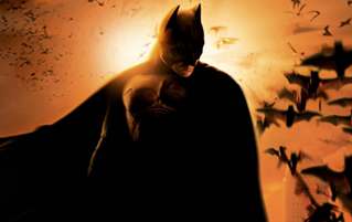
These days, movie trailers are a big deal. Designed by marketing geniuses who train for decades in isolated marketing monasteries, trailers are purpose-built to be shared and discussed on the internet, employing every known trick they can in an effort to go viral.
But they didn't use to be treated that seriously, as evidenced by the following completely baffling trailers made for some very high-profile movies ...
The Original Star Wars Trailers Were Surprisingly Half-Assed

It's hard to imagine a time when people didn't know what the hell Star Wars was, but way back in 1976, George Lucas had to come up with some way to sell his space opera to America. The resultant trailer was decidedly less slick than what you might imagine.
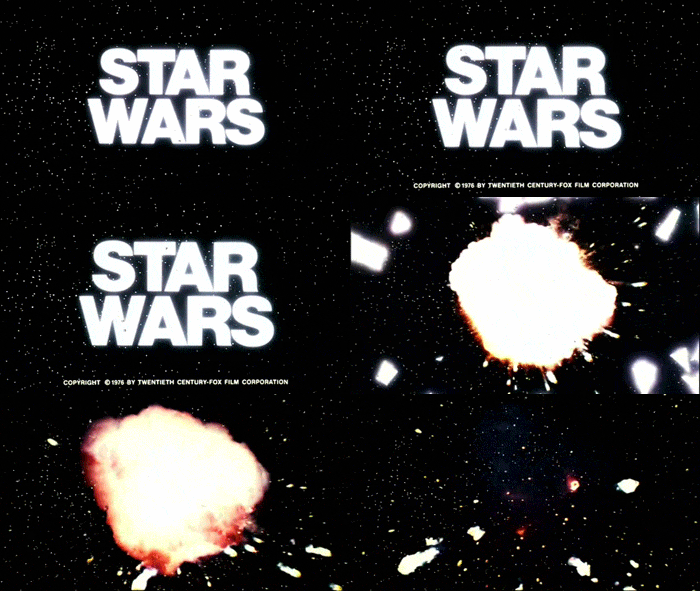
Right off the bat, things aren't normal. It starts off with STAR WARS scrolling forward, like it's supposed to -- only it's not the cool logo we all know and love, but just the words printed in some editor's default typeface.
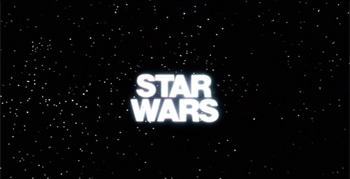
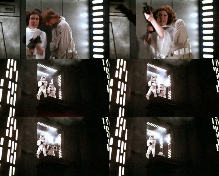
As the words painfully creep toward the screen, like an eye test in reverse, it cuts to some sort of exciting scenes from the movie. It all looks kind of rough, to be honest. The special effects in particular all look a little ropey. The blaster fire looks like gunshots -- less like a galaxy far, far away and more like, well, anywhere in the U.S., unfortunately.
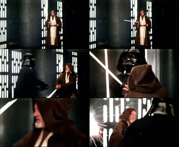
And the lightsabers weren't colored in yet, making these wizened Jedi look like they were dueling with fluorescent light bulbs.
There's a voiceover as well, but it's flat, uninterested, and incredibly vague. "The story of a boy, a girl, and a universe" is an accurate description of about 100 percent of all movies ever made. The whole thing meanders along until the end, when the title randomly explodes -- presumably because the rebels found out that Helvetica Bold has a vulnerable thermal exhaust port.
So that's kind of lame. Surely, they got their act together by the time The Empire Strikes Back came out, right? Nope. The first trailer for Empire was nothing but a bunch of concept art set to music.
Wow, that sucks. We should retroactively all stop watching these movies.
Citizen Kane And Its Needless Ballyhoo

Let's go back even further, to an era when people really didn't understand how trailers worked. Citizen Kane was made in 1941, and is generally considered to be one of the best movies ever made. Now check out its stupid trailer.
It begins with Orson Welles, a big radio star at the time, talking into the world's most dramatically lit microphone.
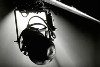
He introduces Citizen Kane as a "coming attraction," delights himself with some wordplay for a bit, and then adds, "speaking of attractions," and then this happens:
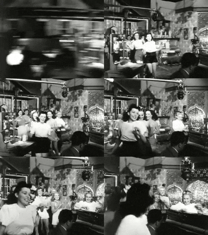
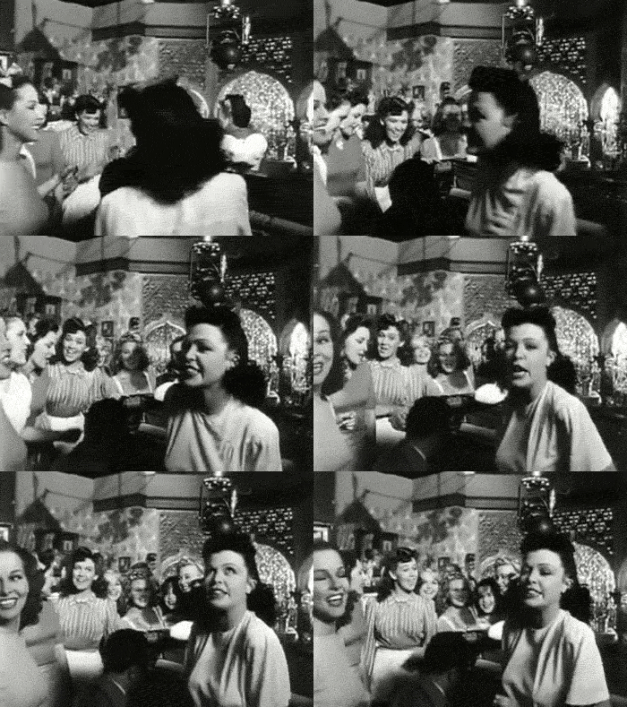
Like a creepy uncle, Welles goes on: "The chorus girls are certainly an attraction. But frankly, ladies and gentleman, we're just showing you the chorus girls for purposes of ... ballyhoo. It's pretty nice ballyhoo." This is another way of saying that the chorus girls do not appear in the film, and in fact have absolutely nothing to do it.
Anyway, the trailer goes on, and Welles begins introducing the real cast in increasingly ridiculous ways.
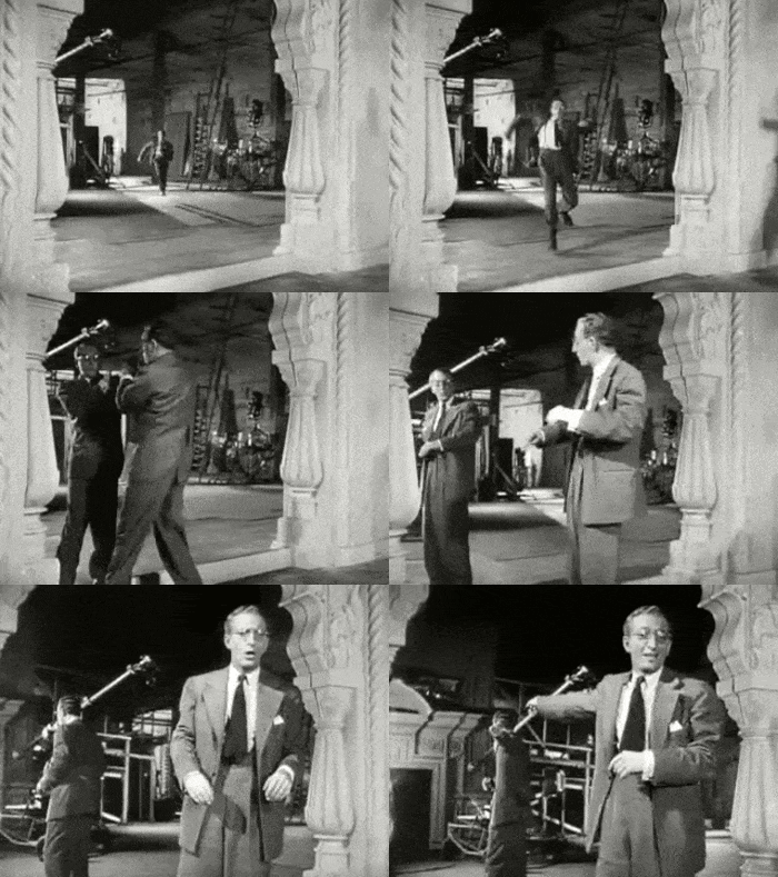
The latter half of the trailer is a little more conventional, and shows clips of characters discussing the titular Kane, making both him and the movie sound somewhat interesting. But it's hard to get past that opening stretch, and the knowledge that possibly the greatest American film of all time sold itself using a montage of screwball zaniness not seen in a single frame of the movie proper.
The Wizard Of Oz Is Inexplicably Coy About What It Is

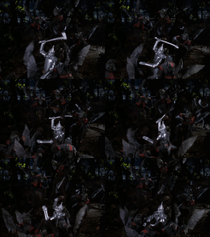
Let's go back even further, to The Wizard Of Oz. There are a lot of ways you could advertise The Wizard Of Oz -- glorious Technicolor shots, one of its award-winning songs, an extended clip of a person melting. But MGM didn't go with any of that with the trailer it ran at the famed Chinese Theatre in Hollywood. Instead, it was a bit more ... cryptic.
This is bizarre for a few reasons. On a basic marketing level, why would you advertise your color movie with splashes of grey and black? Also, the tagline "What is 'Oz'?" doesn't make any sense, seeing as how the film was based on The Wonderful Wizard Of Oz, a popular children's book that was almost 40 years old by that point. And most importantly, where are all the flying monkeys? How do you have a movie with flying monkeys and not put those front and center every chance you get?
ABC Family's Batman Begins Promo Makes It Look Like A Rom-Com

Batman Begins featured a relatively dark and grim version of the caped crusader, especially in comparison to the glowstick-inspired Batman & Robin. But when Batman Begins was aired on ABC Family, for an audience whose families presumably hadn't been gunned down in filthy alleys, the network had to make certain adjustments:
That's right. They turned it into a romantic comedy. All the action scenes are muted or outright missing, and in their place we get a lot of footage of Katie Holmes.
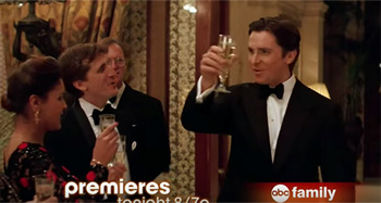
The editing bends over backwards to play up the relationship between Bruce Wayne and Holmes' character. There's a short clip of Bruce raising his glass to make a toast, intercut with a picture of Holmes. The effect makes it seem as though he's toasting his love interest -- and not mock-drunkenly berating his friends so they'll leave in disgust and allow him to brawl with a gang of killer ninjas.
And the few jokes that were genuinely in the movie are now accompanied by digital zooms and sound effects.
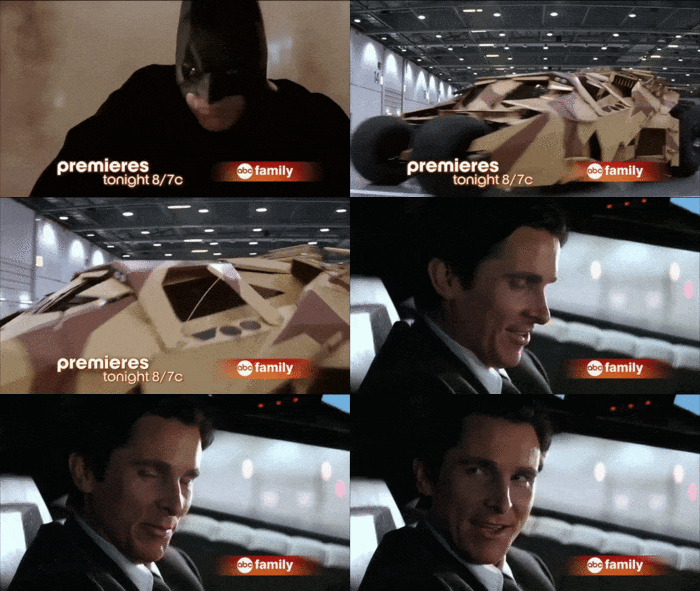
*whip, cash register, and reggaeton air horn sound effects play all over each other*
Most damningly of all is the voiceover, which dares to claim: "He fights for family, and lives for love."
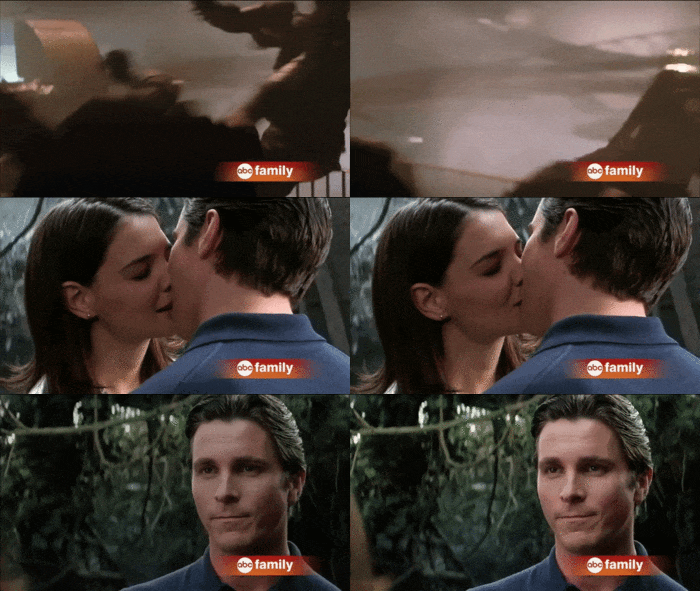
That is not what Batman does. He fights because he's kind of crazy and hates criminals. And what does he live for? Punching criminals. Love is incidental.
The Toys Teaser Is Robin Williams Standing In A Field

OK, so we know Toys isn't technically a "classic." It was a misguided passion project that took years to make, and regularly finds itself on "worst movies ever made" lists. But it's certainly one of the best two or three films Robin Williams made in the latter half of 1992, and that's got to count for something. It also, as with many of the films in this article, has a rather stupid trailer.
A lot of times, studios release teasers for movies that haven't been shot yet by cobbling together something which sort of represents the movie. For example, Fred Claus managed to dress Paul Giamatti as Santa and let Vince Vaughn riff on the comedic possibilities of how hilarious it would be if Kris Kringle had a piece-of-shit brother. That was terrible! But at least it was something.
Because the trailer for Toys was nothing. Literally nothing.
That's it. They decided to just send Robin Williams into a large field to tell some jokes.
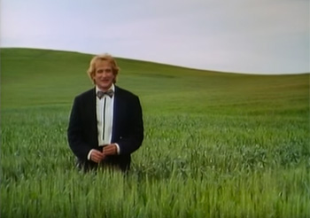
Even calling these "jokes" is a stretch. Williams mainly seems to be improvising, riffing on the fact that the movie is called Toys. Here's a bit called The Toyminator:
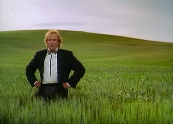
And here's Toyz N The Hood:
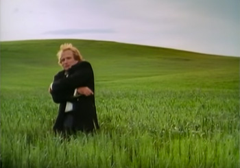
There's also an extensive bit wherein Williams speaks fake Japanese, one set of buck teeth away from being a hideously embarrassing Mickey Rooney character.
Sure, Williams was a big star, so it makes sense to have him be the focal point of the trailer. But why not show something which gives the slightest indication what the movie Toys is actually about? Something like ...
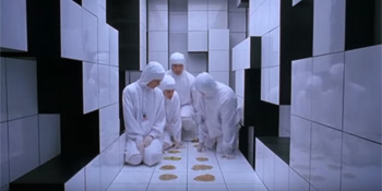
OK, maybe the empty field was the winning play here.
The Maximum Overdrive Trailer Is Like Being Cornered By A Cokehead At A Party

Maximum Overdrive is the only killer truck movie that Stephen King ever directed. Also, the only movie he ever directed.
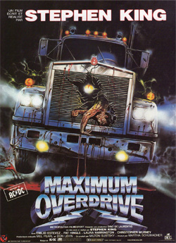
Adapted from one of King's short stories, the film is about a world in which cars have suddenly come to roaring, vengeful life. But that doesn't matter at all. The important thing is that King was famously "coked out of mind" while making the movie. And also, it would seem, while making the trailer. Try to watch this without getting a contact high:
It's King, lurking in the shadows, really intensely telling us how great his movie is. Interwoven with that, as if you needed more, are a semi-coherent collection of clips from the movie itself. Trucks mutilating people, a cacophony of wordless shrieking, and this guy getting hit in the dick with a soda can:
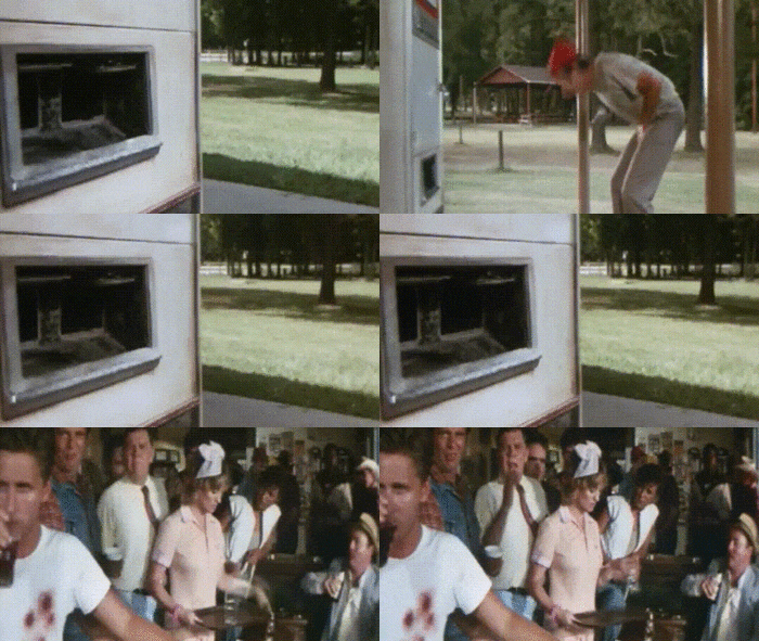
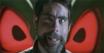
But really, this trailer is all about the master of horror Stephen King and his wide, unblinking eyes. Of particular interest is his claim that if you want something done right, you need to do it yourself.
Miracle On 34th Street Goes Out Of Its Way To Hide That It's About Christmas

Miracle On 34th Street is the cherished story of a possibly crazy old man who proves himself to be Santa Claus thanks to the laziness of post office employees. But that's not how the studio sold it.
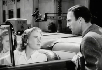
The trailer tells a strange meta-narrative about a studio executive who's unhappy with the trailer for Miracle On 34th Street. It's like the kind of thing Charlie Kaufman would have come up with if he accidentally traveled back in time to save Christmas.
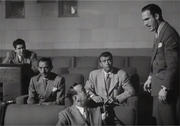
Anyway, even though this executive hasn't seen the movie, he doesn't think the trailer is accurately representing it. So he goes around the studio lot questioning everyone who has seen it.
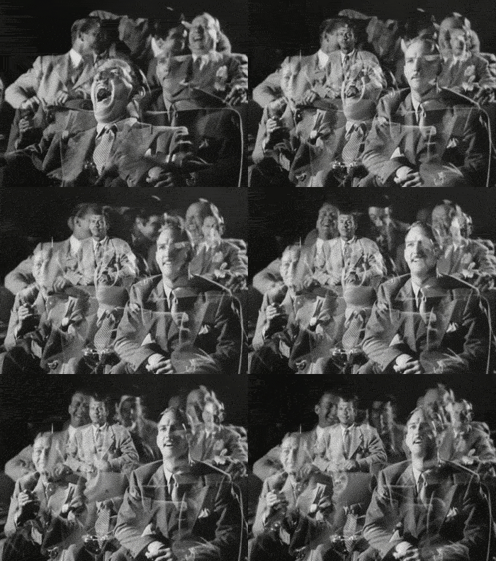
Finally, he watches the movie, but instead of clips from the film, we -- the real audience, let's remember -- only get to see his wildly varied reactions superimposed over each other like a terrible student art film.
The only clip they do show is the goddamn end of the movie.
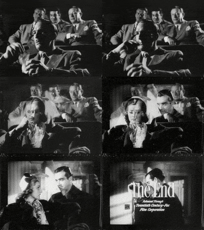
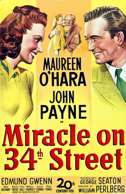
And the reason for all of this chicanery? The studio wanted to actively hide that Miracle On 34th Street took place at Christmas. The logic was that more people saw movies in the summer, and because they thought the movie could be a huge hit, they naturally released it, the story of Kris Kringle, in June. Even the movie's poster goes out of its way to shrink Santa into the smallest possible visual space.
J.M. McNab co-hosts the pop culture nostalgia podcast Rewatchability, which can also be found on iTunes. Follow him on Twitter @Rewatchability.
Also check out The 6 Most Hilariously Misleading Movie Trailers and 5 Annoying Ways Trailers Trick You Into Seeing Movies.
Subscribe to our YouTube channel, and check out 5 Bizarrely Specific Ways Every Movie Trailer Looks The Same, and other videos you won't see on the site!
Follow us on Facebook, and let's have a Maximum Overdrive viewing party.