5 Annoying Trends That Make Every Movie Look the Same

Hollywood: the dream factory, the place where joy is made and everybody craps rainbows and cocaine. But underneath the glitz is a bunch of working stiffs who are either just trying to get the job done, or hacks who get their original ideas by ripping off other hacks.
That's why these days...
Movies are Color-Coded by Genre

Have You Ever Noticed:
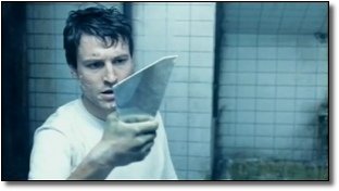
There's some unwritten rule that horror movies should be blue:

The Ring

Saw

The Nightmare on Elm Street reboot.
Meanwhile, apocalyptic movies are gray and washed out:

Then there are more subtle ones, for instance movies set in the desert tend to be yellow. And we don't mean when they're out in the sun and sand, either. Even when indoors it'll often look like it was filmed through a jar of urine:

Smokin' Aces (Las Vegas)

The Hills Have Eyes (rural Nevada)
Movies where reality is off-kilter will be green:

Fight Club

The Matrix films, aka The Greenest Movies Ever Made
Honestly, half the time you can guess the genre of the film based on one still from the trailer.
What's Going On?
It's called digital color correction. Back in the day, if you wanted your movie to have an artistic, stylish color palette, you had to go through the pain in the ass process of using filters on your lights and camera, or get the footage exposed just the right way. It was expensive, it was difficult and it was limited to people who really knew what they were doing. So if someone took the trouble, it meant they had a good reason, dammit.
Now? If you're a Hollywood director, with a few clicks of the mouse you can immediately look stylish and artsy by making the audience feel like they're watching your movie through a pair of novelty sunglasses. Hell, if you've got a Mac and a thousand bucks, you can get a color-correction program and give your home movie of a toddler farting on a cat an otherworldly green tint.
The Coen brothers didn't invent it, but Oh Brother, Where Art Thou was the first movie to heavily use digital color correction, to the point that every frame was digitally colored to give it that old-timey sepia tone.

But where the Coen Brothers were creating a unique and distinct look, other directors have realized these colors are a no-cost way to create atmosphere without, you know, having to write a good script or hire competent actors. These colors are a visual shorthand for various emotions and ideas (yellows seem hotter, blue makes a scene seem lit by spooky moonlight, washed-out grays are depressing). In other words: It's just laziness.
And while we're on color...
Everything Else is Teal and Orange

Have You Ever Noticed:
Just like an early 90s parachute pants designer, movies lately have decided the only two colors they need are teal and orange. As some very sharp-eyed bloggers have pointed out, it's usually unnaturally orange-tinted skin tones against blue skies:


Or against dimly-lit rooms with the bluish tint:


As others have noted, you don't even need to look beyond the posters:

What's Going On?
Not everybody wants to get fancy with that their digital coloring. But everybody wants to get lazy.
This is a color wheel:

You've almost certainly seen one before. Open up your image editing program, it'll have a version of it. It has all of the colors based on how close they are to each other in hue. Now the goal, if you're trying to shoot a nice-looking scene, is to get a good contrast with the colors. Since most movies are about humans, you simply find the closest thing to a human's skin tone on the wheel (somewhere on the upper right) and then make everything else the opposite, most contrasting color (that is, the color on the opposite side of the wheel, or lower left). Teal and orange.
From the beginning of color film, movies have been trying to set up shots to take advantage of this color combination whenever possible. But here in the era of easy digital color correction, they've taken this so far that you get that ridiculous two-color system, where every room is bathed in blue and every human looks like he has a bad spray-on douche-tan.
To be fair, it's not necessarily laziness per se. Your average colorist has to grade about two hours of movie, frame by frame sometimes, in the space of a couple of weeks. It doesn't take that many glances at the deadline bearing down on the calendar before you throw up your hands and say, "Fuck it. Everybody likes teal and orange!"

Ramping (aka, Everything Slows Down Then Speeds Up)

Have You Ever Noticed:
Modern action movies can't just show you the hero landing the final blow. Oh, no. They just have to sloooow it down and make really, really sure you understand that, yes, that is a punch to the face.
In Troy, we have to slow down Brad Pitt's flying dagger attack while he's in mid-air, as if he can stop time like the freaking Prince of Persia:

In Watchmen, we have to bring the action to a virtual dead stop when a fist meets flesh (or anything else significant happens in the fight), to freeze the moment in time to make absolutely extra sure that the audience saw it.

Or there's the 300 method, where the action slows waaaaay down right as the hero is about to do something badass...

...and then SPEED IT UP REALLY FAST WHEN HE STRIKES THE BLOW!

WHAP!
The new Sherlock Holmes movie actually turns this into a plot device, slowing down fight scenes to simulate how lightning-fast Holmes thinks on his feet.
What's Going On?
The film suddenly slowing down is done by a process called "ramping." Instead of film being shot at the normal 24 frames-per-second, it'll be shot at 48, or 72, or 96. The more frames per second, the slower the action.
Now, we've had slow motion since the beginning of film (if you wanted a slower shot back then, you just cranked the handle on the camera faster) but today's digital cameras just make what was already a simple process even easier. So where before you would have an entire shot in slow-motion, aka the bad guy slowly falling to the ground...

...now they can't get through one shot without building slow and fast motion into the same action. The hero draws back the sword at 96 frames-per-second, and drives it into the bad guy's eye at 24. They'll do it 10 times in the course of one action scene, as if it's suddenly boring to watch a couple of guys doing kung fu at normal kung fu speed.
We can lay the blame on two movies: The Matrix obviously played a part with bullet time (which proved you could move the camera around AND have slo-mo at the same time), and 300, which at normal speed is roughly 15 minutes long. Once again, a technique progresses from "innovative" to "standard procedure" to "OK, please stop doing that."
Faking the Documentary Look, Even When it's Not a Documentary

Have You Ever Noticed:
We're not talking about movies that have actual documentary elements (aka Cloverfield), but rather little touches designed to make you think what you're seeing was filmed by a fly-on-wall documentarian with a handheld camera, rather than a gigantic film crew on a sound stage. Even when it makes absolutely no sense for that to be the case.
Even worse, they do this by painstakingly inserting elements that used to be considered embarrassing mistakes.
You've no doubt noticed the painfully obvious "shaky cam" that's so popular these days, where they jerk the camera around the action so you can't tell who's punching who (as if we're supposed to think the opening battle in Gladiator was being shot by some time-traveling war correspondent, and one of the side effects of time travel is apparently severe loss of muscular control).

And this was the clearest shot we could get of Quantum of Solace.
But there are more subtle, and sillier ones. For instance, crap landing on the camera lens. District 9, awesome as it was, actually obscures the lens with blood from time to time. But before that you saw it in Braveheart and We Were Soldiers. During the opening battle in Saving Private Ryan you got both blood and water splashing on the lens.

Then you have the, "Whoops, we accidentally pointed the camera into the sun!" lens flare, where the light actually glares off the lens and obscures part of the shot:

Karate Kid

Transformers

Star Trek
Fans complained so much about the lens flare effect in Star Trek that J.J. Abrams had to issue a statement basically apologizing for it.
What's Going On?
The idea is if the shot looks accidental, then that is supposed to subconsciously say "realism" to the audience (rather than "sloppy"). Movies shot the old way (that is, in a way where you could clearly see what was freaking happening) now look too clean and staged. If you want to make the movie look real and gritty, you need to mess it up, so it looks more like a documentary. Though we're not sure how that still works if it's in every movie.
We suppose that's where you draw the line between directors who do it for a reason, versus ones who are just hopping on a bandwagon. For instance, those battle scenes in Saving Private Ryan had an unsettling sharp, almost stuttering effect because Spielberg intentionally messed up the camera's shutter to make it look less like a movie and more like real war footage for newsreels back in the day.

The goal was to bring home the horror of the war. A decade later, you can see the same effect in the fight scenes in Crank: High Voltage.

The ridiculous irony with all of these is that technology has been carefully crafted over time specifically to prevent them. For instance, modern camera lenses have reflective coating and other treatments specifically to prevent lens flares. Virtually every time you see it in a movie, some poor bastard has had to go back in and add it with CGI, or else they had to specifically stage the shot so the sun was in perfect position to give them a shot that used to get cinematographers fired.
3D That Somehow Makes the Movie Look Worse

Have You Ever Noticed:
There's something weird going on with 3D. On one hand, Avatar was so crisp that it looked like you could jump into the screen. Pixar movies like Up and Toy Story 3 look like dioramas--the depth of field making it seem like you could reach in and grab one of the toys out of the universe.

But then you have these other movies, showing in the same theaters, that you watch with the same glasses, that look like shit. It hasn't gone unnoticed: Clash of the Titans famously was released in 3D and Jeff Katzenberg, the guy pushing 3D heavily, said it looked so bad it was going to kill the format.
But the low point has to be The Last Airbender. Forget about the dialogue and acting for a moment--it had a 3D job so terrible that it looked significantly worse than any of the old-fashioned 2D movies it was being shown alongside. Everything was dark and muddy.

Or maybe we just don't know what genius looks like.
What's Going On?
What they're failing to tell you in the ad campaigns for these films is that not every 3D movie was actually shot in 3D. Most of them weren't, in fact. They were instead converted to 3D after the fact. Not only does it not give you anything like the illusion of depth that 3D is supposed to be used for, but it actually degrades the whole image.
The reason is technical: The 3D conversion darkens the image a lot as a function of the process. You lose light both when converting the film, and then from the glasses, meaning you essentially make a bright film overcast and render a dark film impossible to see. So if a film was dark to begin with, like The Last Airbender, turns into a murky mess.

Why would they do that? Because the converted 3D movies can charge the same ridiculously inflated ticket price as the real 3D movies. We're talking up to a 50 percent markup here.
Do the math: It only costs the studio $10 to $15 million to do this quick and dirty 3D conversion, yet it helps a mediocre movie like Clash of the Titans make $500 million worldwide. The jacked-up 3D ticket prices alone will earn that money back many times over.
So, the same rule applies here as it does everywhere: If it's making them rich, why ever change it?
Do you have an idea in mind that would make a great article? Then sign up for our writers workshop! Know way too much about a random topic? Create a topic page and you could be on the front page of Cracked.com tomorrow!
For more Hollywood dipshittery, check out 5 Innovative Ways Hollywood Is Screwing You Over and 5 Things Hollywood Reuses More Than Plots.
And stop by Linkstorm (Updated 08.04.10) to discover which director has actually made every Hollywood movie in the last 20 years. (It's Uwe Boll.)
And don't forget to follow us on Facebook and Twitter to get sexy, sexy jokes sent straight to your news feed.