7 TV Ads That Take Themselves Way Too Seriously

Making good commercials is an art, and like any art some people end up taking it way, way too seriously. What follows is a testament to those select few who dropped out of film school in their third year and simply refused to let go.
Tourism Australia

Making a commercial to attract tourists to the land down under seems like it should be a pretty easy task: Have lots of shots of the nice scenery, show people having fun on the beach and edit out anything that shows giant poisonous spiders or the native Australians stealing suitcases.
Yet, instead of going with the easy and conventional approach, director Baz Luhrmann gives us a depressing insight into one woman's private Hell:
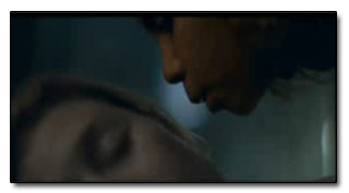
In just a few seconds we learn that our woeful protagonist is suffering from relationship problems and is having serious trouble at the workplace. That cuts quite logically to an apparently naked boy trailing this poor woman to her apartment. First she begins to hear his voice while watching the news, and then things really get creepy when he lets himself into her apartment and whispers, "Sometimes we have to get lost to find ourselves," to her while she's sleeping. You're blowing our minds, Australia!

"Come visit Australia... or else."
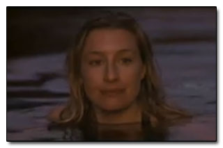
By the time the nude kid pours sand into the delusional woman's hands and we cut to a blurry shot of the water, most viewers are ready to hear the name of what they suspect is M. Night Shyamalan's newest film. Only after we see her happily swimming with her man who loving says, "I'm glad you're back," do we finally learn what this ad is about, as "Australia" flashes briefly on the screen.

So, apparently Australia is a great place to visit if you're suffering from crippling depression and regularly hallucinate about naked boys. For the more mentally stable among us who just want to drink beer and look at kangaroos, you're out of luck.
Federation Against Copyright Theft

The Federation Against Copyright Theft had a simple strategy: get the good citizens of the internet to turn the pirates in. Of course, the only way to witness illegal file sharing is to illegally share files. Somewhere along the way, The Federation decided the best way around the gaping hole in their plan was to scare the shit out of five year olds with an avant-garde film made entirely by retarded people.
In the ad, a sinister looking man jabs a hot poker at the camera as a narrator explains that the pirates are out to get us! You might have heard The Federation is worried that the average consumer is turning to pirated goods. But that's really secondary to their concern for your safety, what with all these pirates making shit explode everywhere.

In a shocking reversal, the ad threatens to make a coherent point as it explains that piracy costs jobs by harming the music and publishing industries. But that quickly gives way to the sound of machine gunfire and chanting voices as our narrator explains that piracy funds terrorism, and that terrorism destroys "our development and your future enjoyment!" Wait, what?

If you see Wolverine: Origins before it hit theaters, they win.
This "anti" piracy ad manages a rare double whammy of ineffectiveness. It portrays the people they're trying to get to help them as fat lunatics wielding glowing thunder sticks. And then, when they actually wander within shouting distance of a valid argument, the best they can muster is that it's all part of the terrorist's extraordinarily long drawn out plan to make you watch shitty films. If the terrorists plot extends to overwrought short films masquerading as anti-piracy ads, it looks like they've already won.
Land Rover

When your epic two minute car commercial only features the actual vehicle on screen for about 15 seconds, you know it's time to make a better vehicle and/or purge the marketing department. Rather than taking the traditional car ad approach and, you know, showing the viewer what features the car has, we are instead treated to what sounds like the opening paragraph of that paper your philosophy student roommate got an "F" on.
At first the ad hangs on to some illusion of normalcy as we see stressed workers in an office, apparently about to have their entire careers turned around by buying a new car. But then bubbles start flying through the air, children on horses plow through clouds that are... on the ground, for some reason, rain pours from the heavens and everything quickly descends into incoherency.

"Yes, I'd like to pay for this car... with time."
As we mercilessly forge onward to the finish line, the commercial descends into utter madness. Two Asian women emotionally hug for no apparent reason, and the driver at the start of the ad wanders through what appears to be a post-apocalyptic wasteland while his stolen car drives by in the distance, where it is promptly attacked by people wielding giant balls of fire. We then fade to black, having learned absolutely nothing at all about what makes Land Rovers better than any other vehicle on the market.
Thai Insurance

Proving that it's not just Americans that can make bad commercials, Thailand's rapidly growing advertising agencies have been making huge advances in the field of baffling ads.
The commercial starts off with a father saying his newborn daughter is the first miracle of his life. Right in front of his wife. I guess meeting the woman he loves and marrying her doesn't count as a miracle. What a dick.

The next 45 seconds of the ad features a montage of the father taking care of his young child, with soft piano music in the background. Just when you're starting to feel all warm and fuzzy, tragedy strikes, and it strikes hard.
Another, much shorter montage shows us that daddy's innocent little girl has been knocked up, and he doesn't look very happy about it. His wife urges to go easy on her, and when the girl tearfully apologizes he responds in a rational and thoughtful way by slapping the shit out of her. At least that's what it's supposed to look like, but the daughter ends up taking one of the greatest dives in Thai commercial history.

Yet she somehow manages to get to her feet instantly, allowing the two to embrace. Wow, he sure came around quickly; domestic abuse pun definitely intended. Cue powerful string music and the sounds of the daughter sobbing that clearly don't match up with her mouth in the video, one more montage for good measure and that pretty much wraps things up. Cut for time: The father chasing down his daughter's boyfriend with a knife, only to have a change of heart and welcome him into the family right after stabbing him.
This sure was a great ad that took babies, pregnancy and dosmestic abuse and totally endorsed, or possibly condemned it. The tag boasts that it's an insurance company, but what can you insure against? Premarital pregnancy? Abusive, bipolar fathers? Bad acting? What are the premiums like for that?
Dunlop Tires

This 1993 commercial features the Velvet Underground in the soundtrack, and upon first viewing it you'll probably have trouble telling it apart from an actual music video.
But examine it carefully, and you'll soon spot all of those classic tire commercial elements: Women in surreal costumes...

... random bursts of flames...

... pianos cruising down the road and tumbling off of bridges...

...some strange orc like monsters...

... and what appears to be a sumo wrestler spreading ball bearings.

The motto at the end of the commercial states that these tires are "tested for the unexpected," implying that no matter what comes your way while you drive, your bitching Dunlop tires can handle it. Look, if your morning commute involves any of the items on the above list, you have problems far, far beyond what brand of tire you currently employ. So the next time you're driving down a road covered in ball bearings and you almost get pulled over by a woman with a birdcage on her head, don't think about switching tire brands. Just get the fuck out of town.

Again, we have another product where the method of advertising should be pretty simple. The Halo series is mostly powered by brand name anyway. All that really needs to be done is to slap together a few gameplay clips and air them for a couple of days for the benefit of the three gamers who haven't heard of the series.
Instead we have a faux-war documentary featuring someone impersonating a BBC narrator and a man who looks a little too old to have any idea what he's advertising.

"I remember taking a bullet at Normandy... Uh, I mean, at the Halo 3."
The touching scene takes place at the vaguely named Museum of Humanity, which based on the opening shot of the commercial is a giant building dedicated entirely to one tiny diorama. While using a diorama to show the scale of the battles seen in the game is kind of a neat idea, it quickly loses its appeal when you actually play Halo 3 and discover that your comrades spend half the game getting gunned down uselessly and the other half playing bumper cars with you while you're trying to drive places. So in retrospect, it's hard to view this commercial as anything other than a memorial to Master Chief's "special" comrades.

Along with the other commercials in the series, this marketing campaign cost about $10,000,000 to create. The amount of income brought in by convincing people who otherwise weren't going to buy the game to purchase it? About zero.
Apple Computers

Let's say it's 1984, you've just started a computer company and you want to compete with the giant of the industry, IBM. Do you (A) make a simple yet eloquent commercial that shows off the advantages your new product has to offer, or (B) hire Ridley Scott, give him just under a $1,000,000, order him to direct an homage to George Orwell's famous dystopian novel while only vaguely referencing computers, and then air that Frankenstein monster during the Superbowl?
If you picked A, then congratulations, you're a normal human being. If you picked B, you're Steve Jobs. You're also completely insane, but you're probably too busy building a house made entirely of gold bricks to care.
For reasons beyond our understanding, this commercial is considered one of the greatest ever made, and also one of the most influential. We guess there's something about watching Anya Major throw a sledgehammer through a giant television screen that really speaks to people.

Feeling the urge to go buy a new computer, aren't you?
But one group of people this ad didn't speak to were those in charge of the George Orwell Estate, whose legal actions made sure that this commercial would never again be aired on television.
So, we've got lawsuits, and public praise and public outrage. All of this is made retrospectively less important when you realize that the technology everyone was making a big fuss about...

...was this.
For more strange commercials, check out 6 Baffling Old-School Video Game Commercials. Or just go ahead and relive your worst nightmares via the ads in 10 Awesome Ads (For Traumatizing Children).
Then go to Cracked.com's Top Picks to rinse the stench of commercial failure of your skin with stuff from the Internet that doesn't come from us (we know, we're shocked also).