Lost In Translation: 20 Baffling Foreign Movie Posters

Most movie posters are boring as hell. It's always some Photoshop of the stars, and maybe an explosion thrown in if it's an action movie.
Or at least, that's the way they are in America. Go to Eastern Europe, or Japan, and you'll find posters that have absolutely nothing to do with the film, and everything to do with melting a hole in your brain.
Alien (Poland)

"I've got an idea for a poster. It'll convey that the movie is so awesome, your skin will melt off!"
"Great. So there'll be, like, a skull there?"
"Sure, sure."
"And you have seen a skull before, right?"
"Eh, I can pretty much guess what one looks like."

Star Wars = space cowboy, which is understandable. Why the space cowboy seems to be constructed out of appliance catalogs, however, is not.
Star Wars (Russia)

Another Star Wars poster for the Russian market, in which Vader is some kind of robotic disco puma. So, the people who went to see the movie based on this poster ... were they disappointed?

Little known fact: The Turkish Director's Cut featured Shelly Duvall and swashbuckling zombies. Seriously, can you fuck up the poster for a Jack Nicholson classic any worse than this?
Chinatown (Poland)

Yes, yes you can. Poland makes our list for the second time by portraying Chinatown as the fantastic tale of an uptight middle-aged woman tormented by Pedro the mischievous, nostril-stabbing elf.

Ghostbusters (1984): Patrick from Spongebob tries to avoid being prison-raped by Giant Aardvark Man. Rated PG.
Bad Lieutenant (France)

We have to hand it to France. If somebody ever enacts some kind of "Truth in Advertising" law for movie posters, this is what the Bad Lieutenant poster would look like. The above image gives you everything you need to know before making your ticket purchasing decision.

So Poland is going to try to dominate this list, isn't it? Just look at that shit. Now here's the thing; they have TV ad campaigns for these movies, right? Don't the Polish people get confused when these ads show a couple of wacky kids in a slapstick farce with their dead boss, while the poster shows whatever the hell that is up there?
Or do they change the ads, too; replacing them with just the above image over the sounds of a heartbeat and a child crying softly in the background?
Alien (Czech Republic)

"The Americans have not allowed anyone in Eastern Europe to see this 'Alien' film, but we must have the poster completed by this afternoon!"
"Well... I have this thing I was making last night, it's an album cover for my band."
"Perfect!"
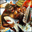
King Kong (France)

Choke slamming a shark and "Mega Sound"? This is how you sell a freaking movie, kids.
Big (Czech Republic)

"That's your poster for the JFK movie? You're fired, you sick bastard."
"Uh... no! Of course not! This is the poster for... Big, the Tom Hanks comedy about a man who changes bodies with a child!"
"Perfect! Here is your raise."
Army of Darkness (Japan)

Having just watched the first few minutes of the film before slapping their poster together, the Japanese marketing department renamed Army of Darkness to Captain Supermarket because, you know, Ash worked in one.
You can just picture the poster designer tapping the pencil on his desk thinking, "Okay, supermarket. Let's get a bag of groceries on there. What else do they sell at the supermarket? Soup! Campbell's soup! And the star is named Bruce Campbell! It almost makes too much sense!"

We're too terrified to make a joke.
Easy Rider (Czech Republic)

Well it would appear that this poor man has a dove for a dick, and is trying to fuck the horseheaded guy. The question is: Which one is Jack Nicholson?
The Fly (Poland)

Of course you have to tell the audience that the movie has a scene with a fly-monster puking. Why else would they buy a ticket? Oh, and go ahead and imply that the fly is played by Kojak's Telly Savalas just to make sure.
First Blood (Japan)

Japan repackaged First Blood as a kickass motorcycle chase through the city with Dukes of Hazzard-esque ramping of cop cars (bottom). But at least they portray the safety-conscious Sly as wearing a nice padded helmet.
Planet of the Apes (Poland)

Props to the designer for both drawing a literal planet made out of an ape and giving away the twist ending.
But here's the problem: Once audiences have actually seen the movie and realize it's not actually about humans landing on a monkey-headed globe in space, how do you do posters for the sequels?
Escape from the Planet of the Apes (Poland)

We knew we would regret asking that question.
Deliverance (Yugoslavia)

We all know why this could have been worse.
Okay, before we go, let's hear from Poland one last time. Let's pick a movie they couldn't possibly turn into nightmare fuel: The Muppet Movie.
The Muppet Movie (Poland)

And... you are now insane. Sorry.
For more tasteful foreign cinema, check out 9 Foreign Rip-Offs Cooler Than The Hollywood Originals and Ridiculous Overseas Rip-Offs of American Films.
And visit the foreign version of Cracked.com's Top Picks by clicking the link (we went ahead and translated it for you so you'd know where to click).